AI is moving fast. Responsibility isn’t always keeping pace. As organisations race to adopt new technologies, clarity, control, and accountability are too often left behind, replaced by black boxes and borrowed trust. Yet the systems shaping our future demand something more considered. Something more human.
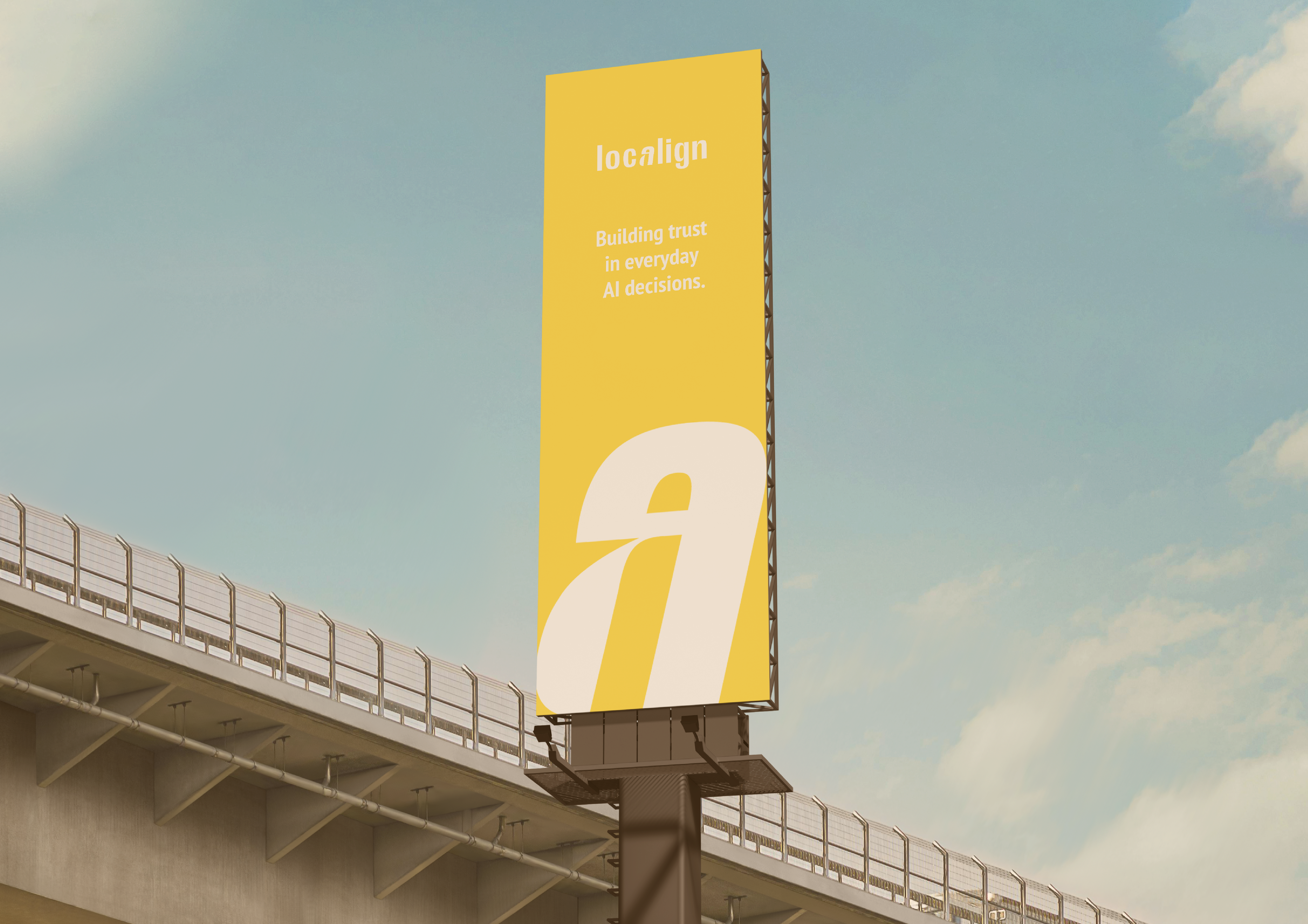
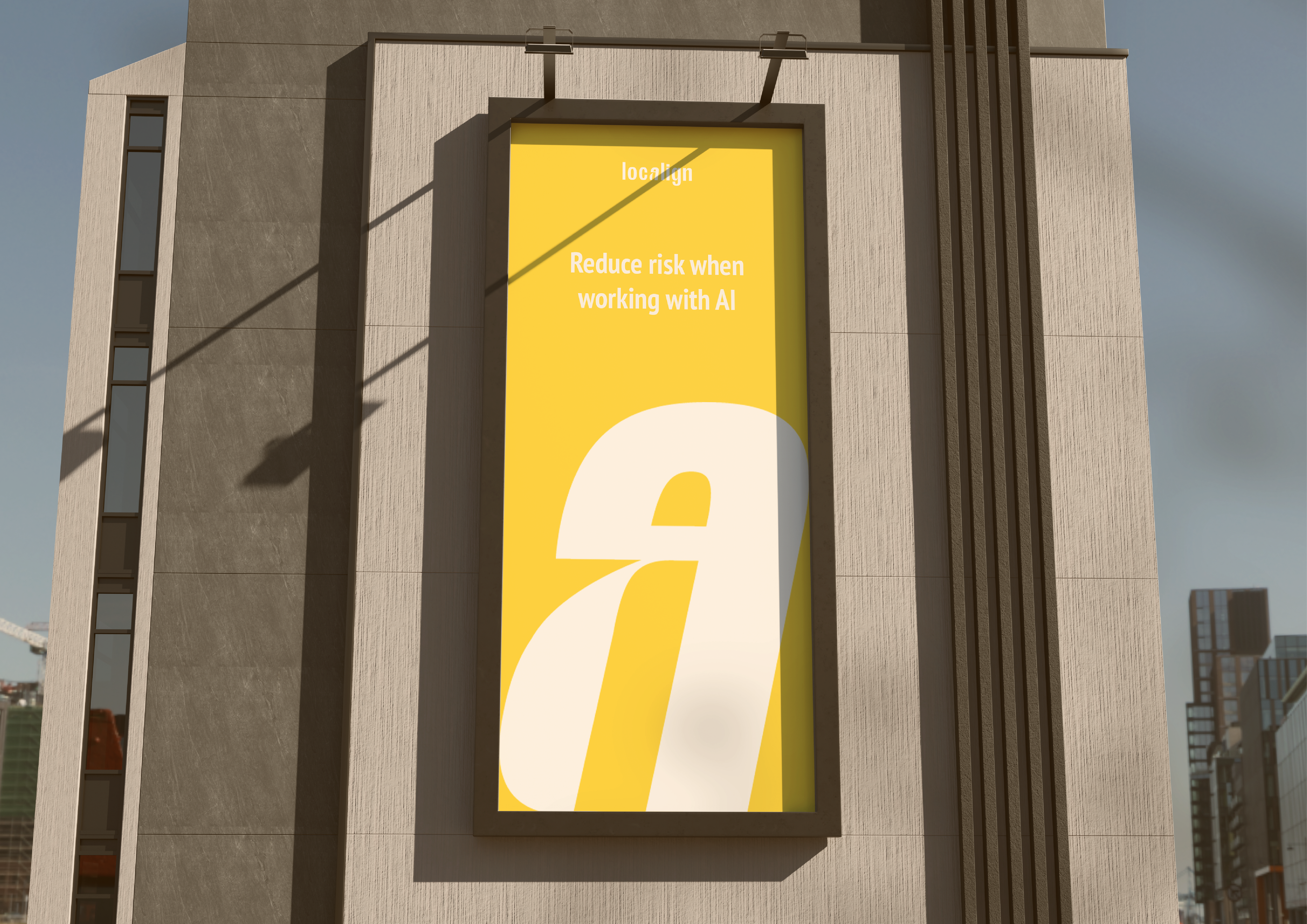
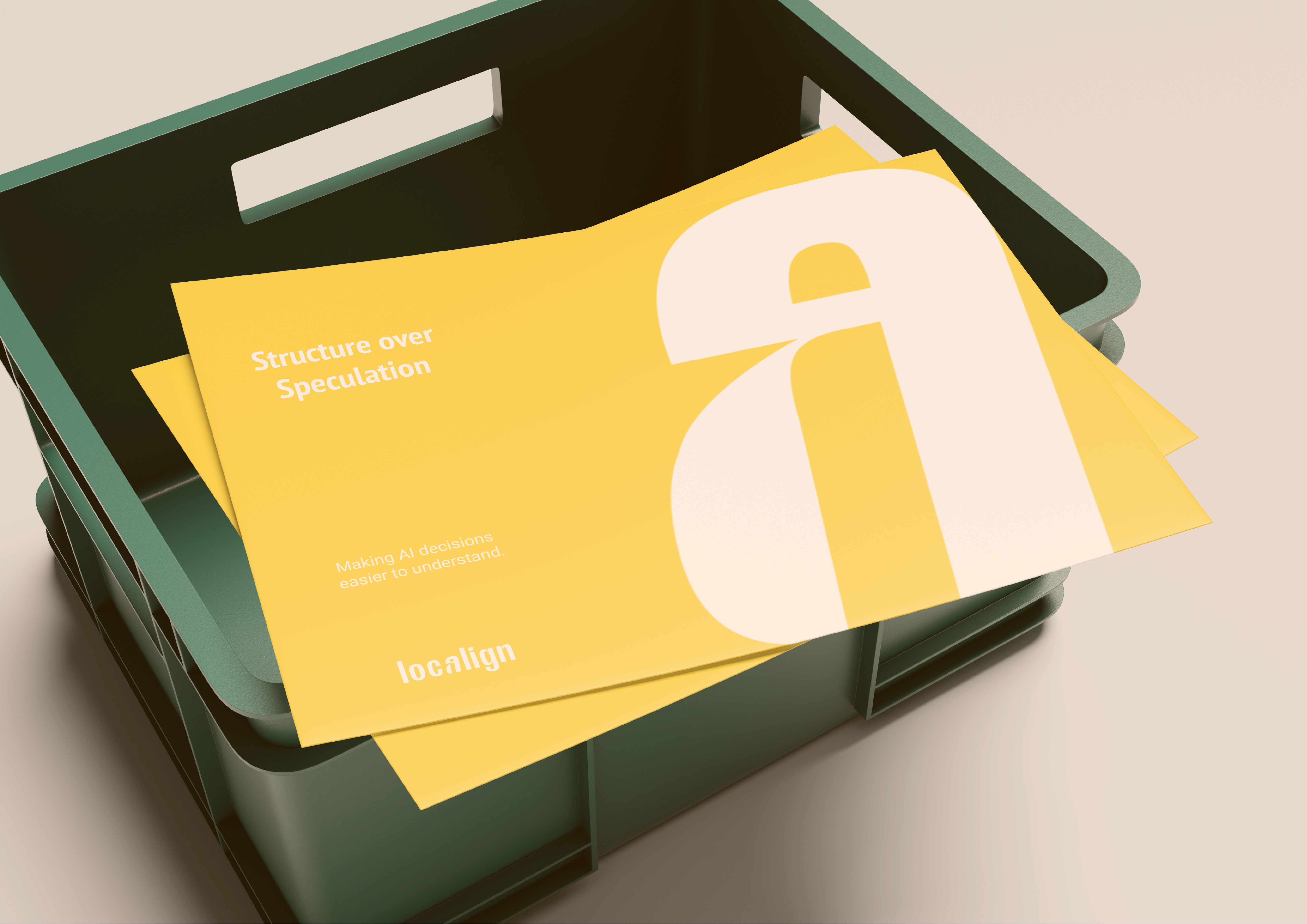
Enter Localign. A platform built to help organisations use AI responsibly, with sovereignty, transparency, and agency designed in from the start. Grounded rather than speculative, Localign positions itself as calm infrastructure in a landscape crowded with hype. The brand reflects this mindset through clarity, restraint, and precision, creating a presence that feels dependable, intelligent, and built to last.
Scope
Brand Strategy
Visual Identity
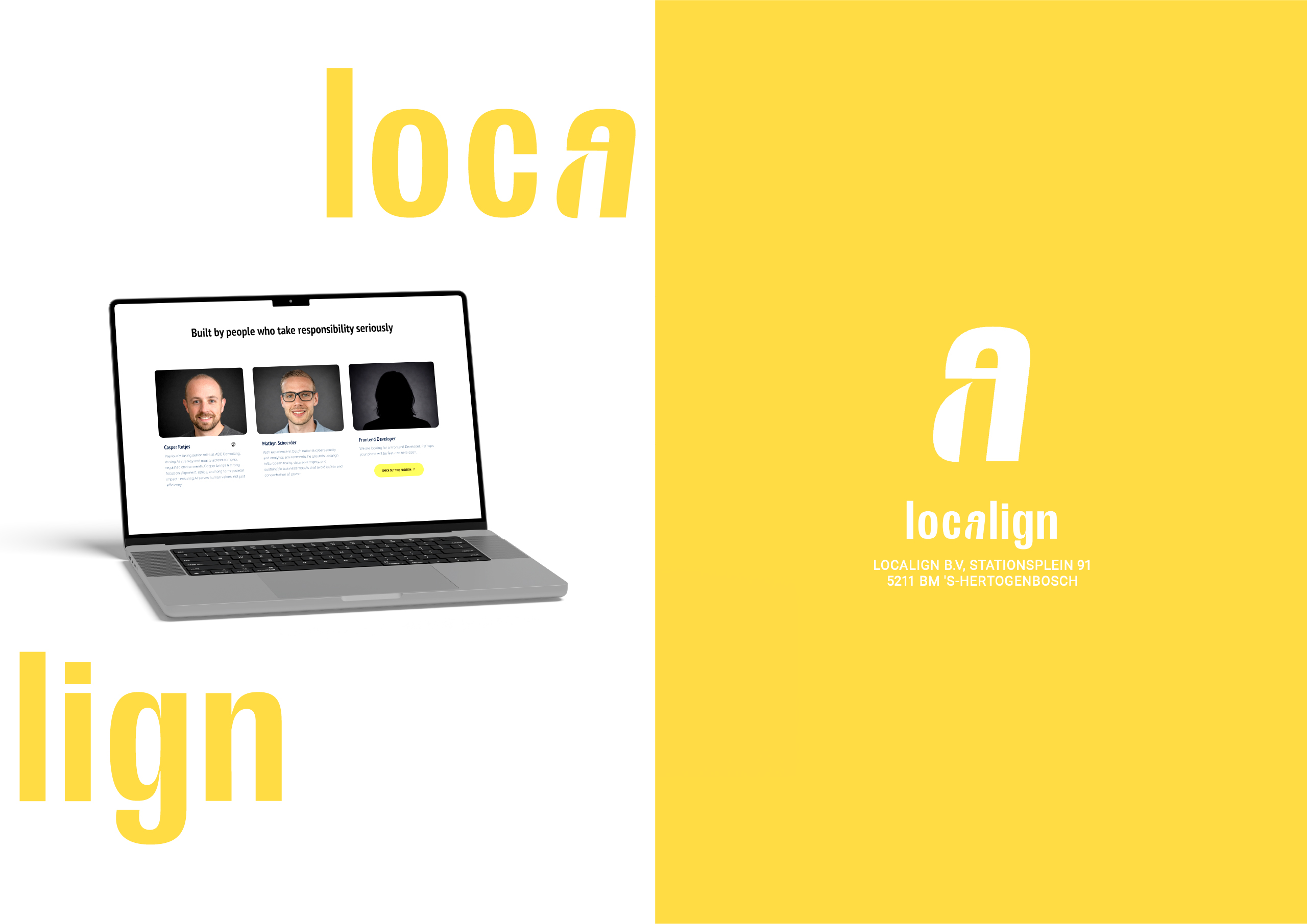
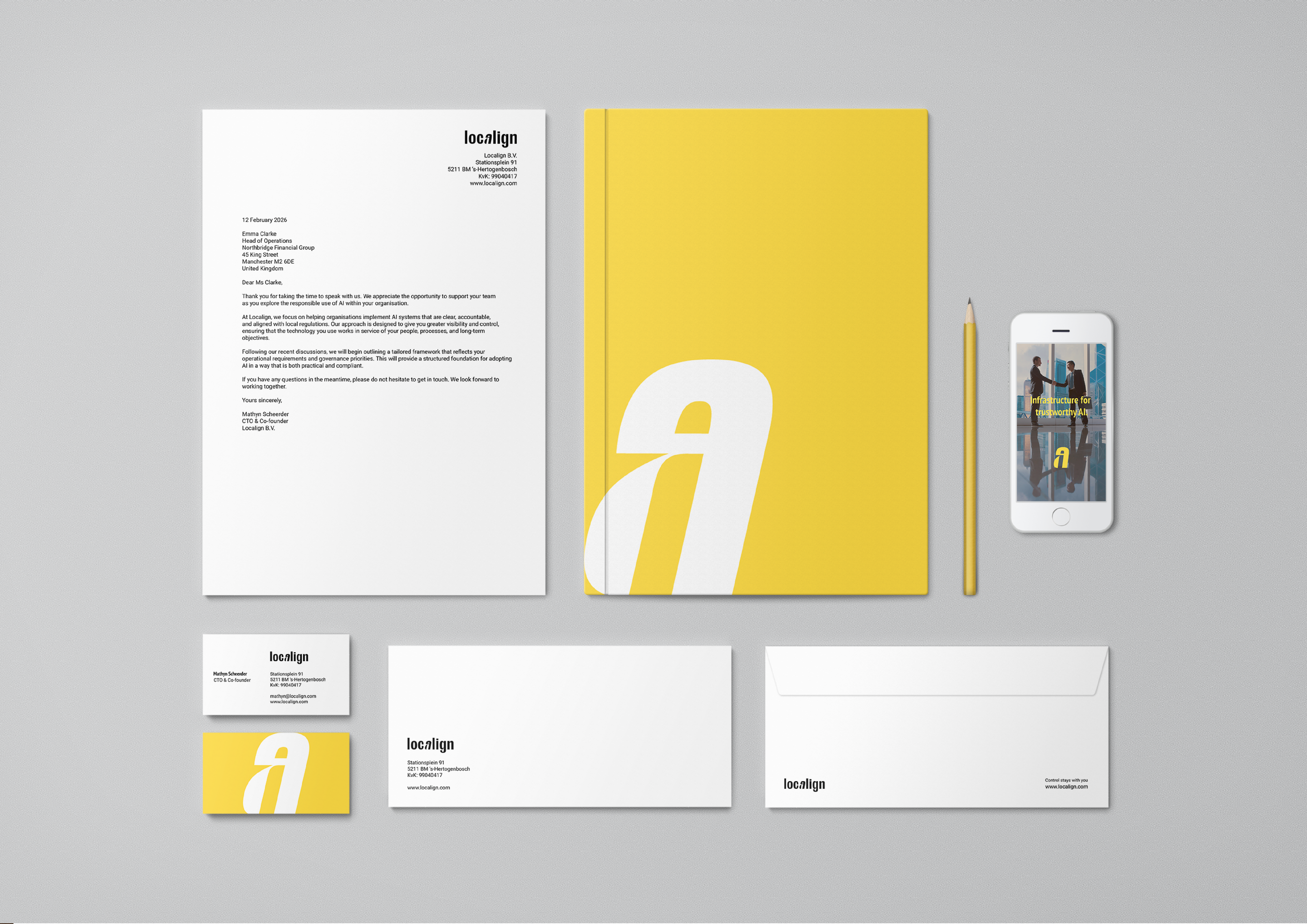
Logo Design
Typography System
Colour System
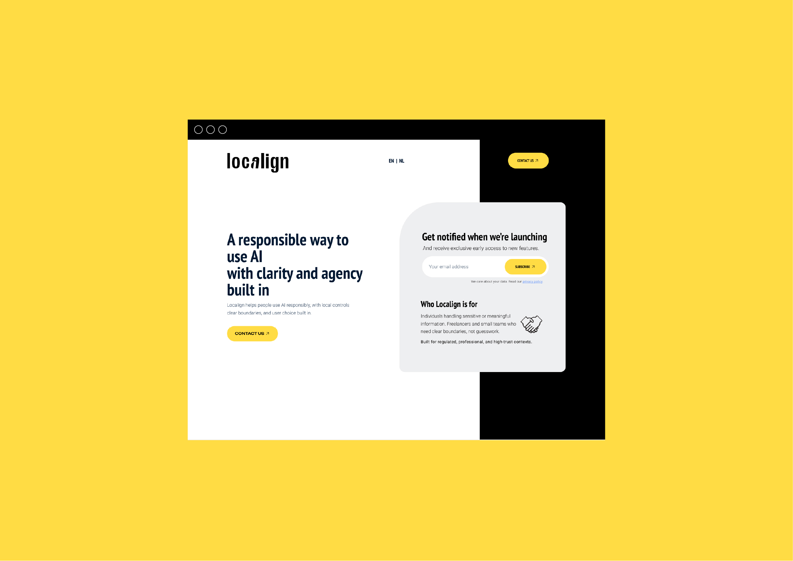
Homepage Design
UI Direction
Brand Guidelines

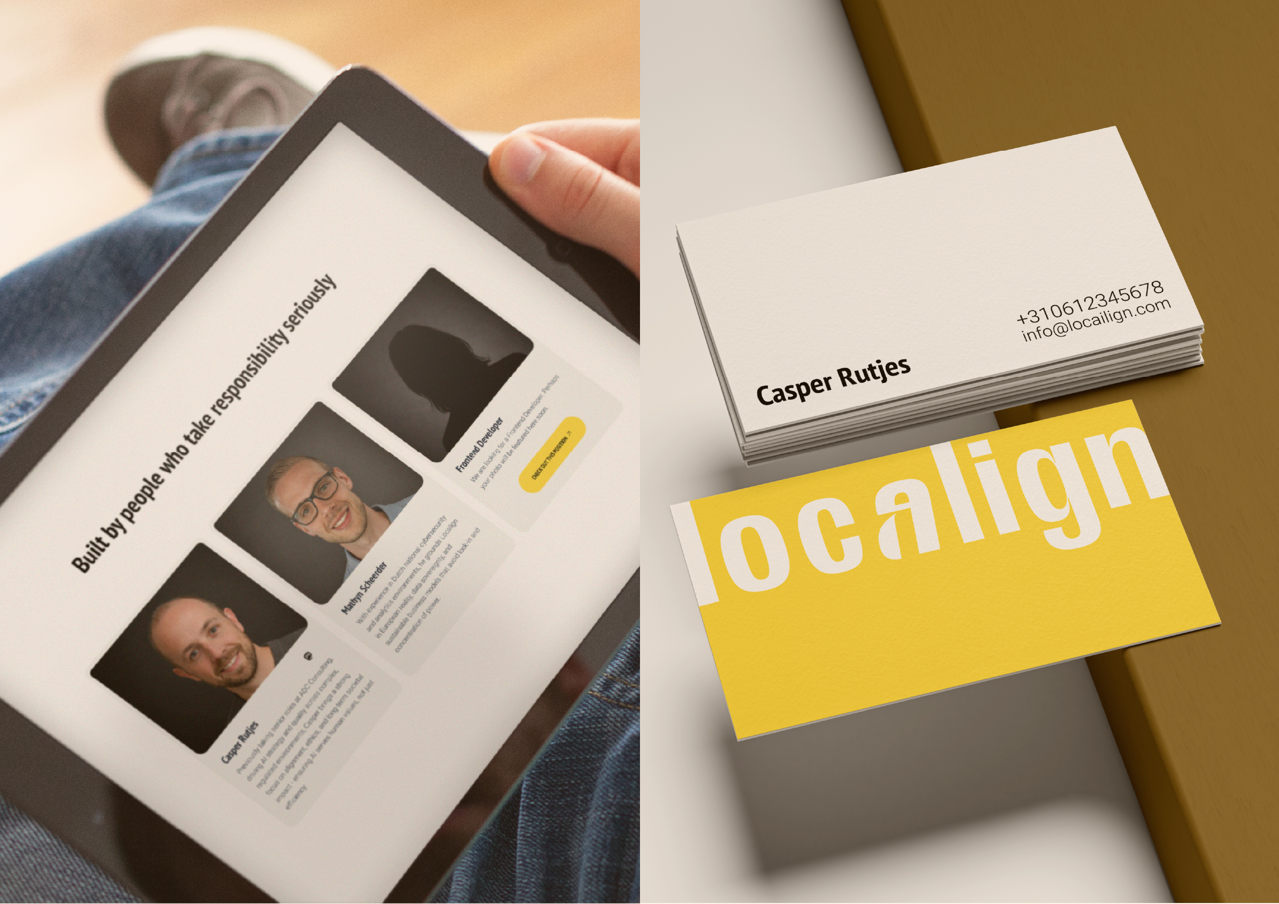
About Localign
Localign is building a more responsible way to use AI. Grounded in clarity, agency, and local control, it exists for organisations who want technology to work in service of people, not the other way around. In a landscape crowded with hype and black boxes, Localign brings structure, transparency, and confidence to every decision.
Designed with governance at its core, Localign aligns AI with real-world laws, expectations, and human values. The result is calm, dependable infrastructure that makes complex systems understandable and accountable, giving teams the trust and control they need to move forward responsibly.


Design Approach
My approach was grounded in clarity, restraint, and trust. For Localign, the opportunity was not to add more, but to remove noise and create a brand that feels calm, credible, and dependable in a space often dominated by hype. I focused on building a visual system that communicates maturity and responsibility from the first interaction, positioning Localign as infrastructure rather than another tech startup.
From the wordmark through to typography, colour, and layout, every element was designed to feel intentional and disciplined. Clean forms, generous spacing, and a restrained palette work together to create confidence without decoration, allowing the message to lead. The result is a considered identity that feels precise, human, and built to last, supporting organisations who need clarity and control when working with AI.

Brand Voice
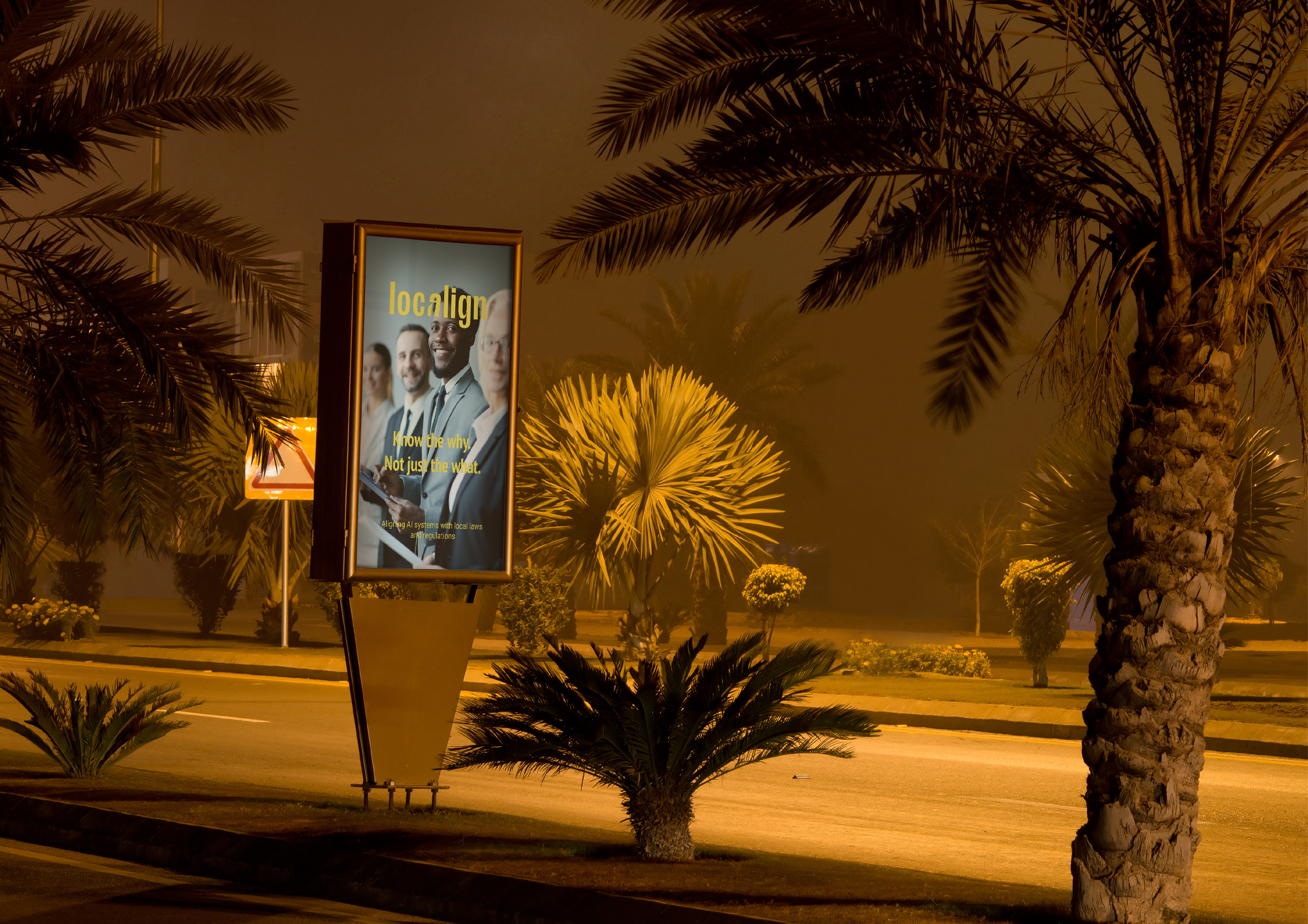
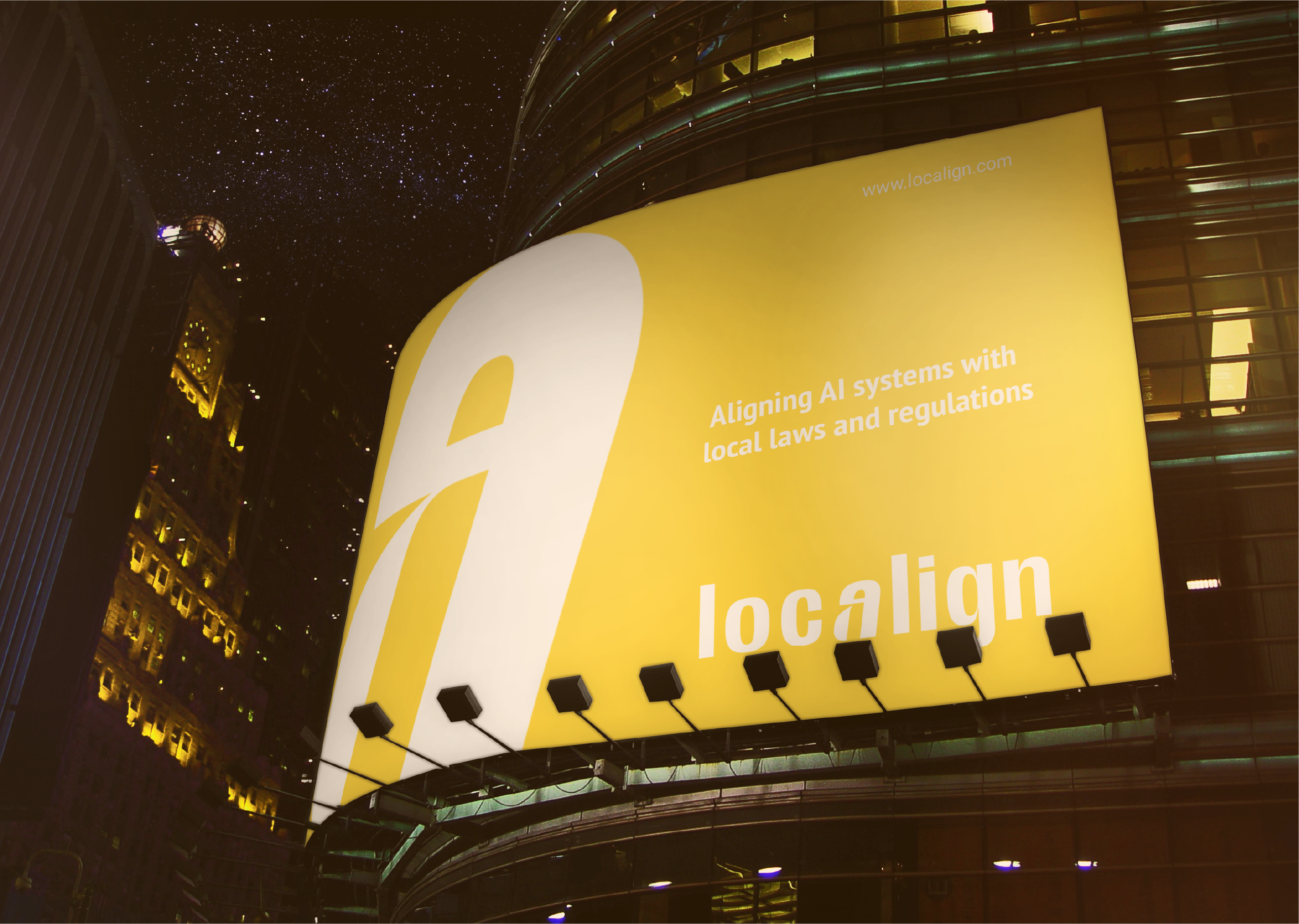
Localign’s visual identity is designed to express clarity, trust, and responsibility through restraint and simplicity. The wordmark is clean and typographic, creating a calm and confident presence that feels more like infrastructure than a startup product. A subtle customised letterform introduces a distinctive detail that reflects alignment and precision without relying on obvious technology cues. The colour palette pairs neutral tones with a warm accent to balance professionalism with approachability, supporting a human first tone while maintaining credibility for enterprise and regulated environments. Overall the system prioritises clarity, whitespace, and disciplined design choices to communicate maturity, reliability, and long term trust.