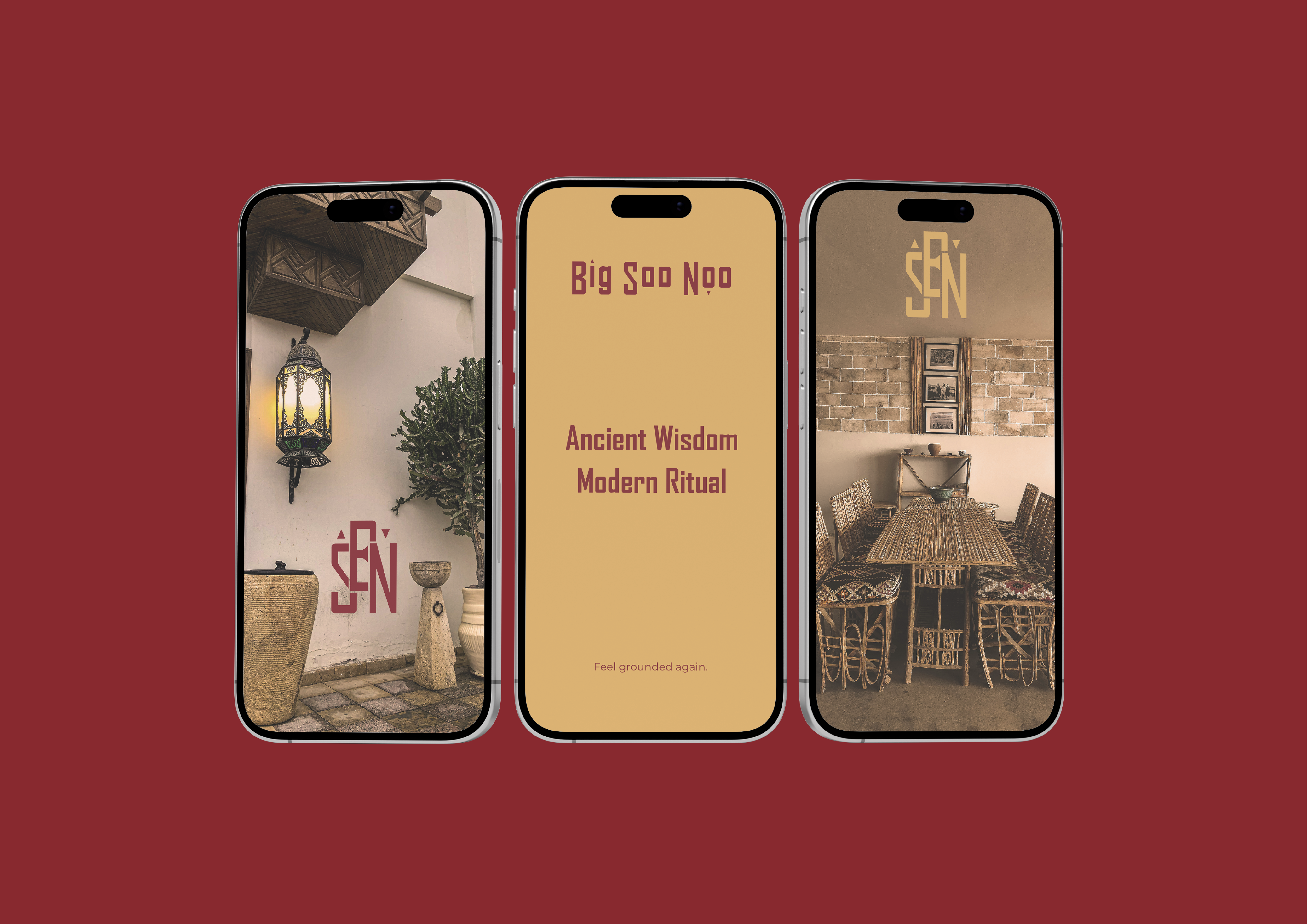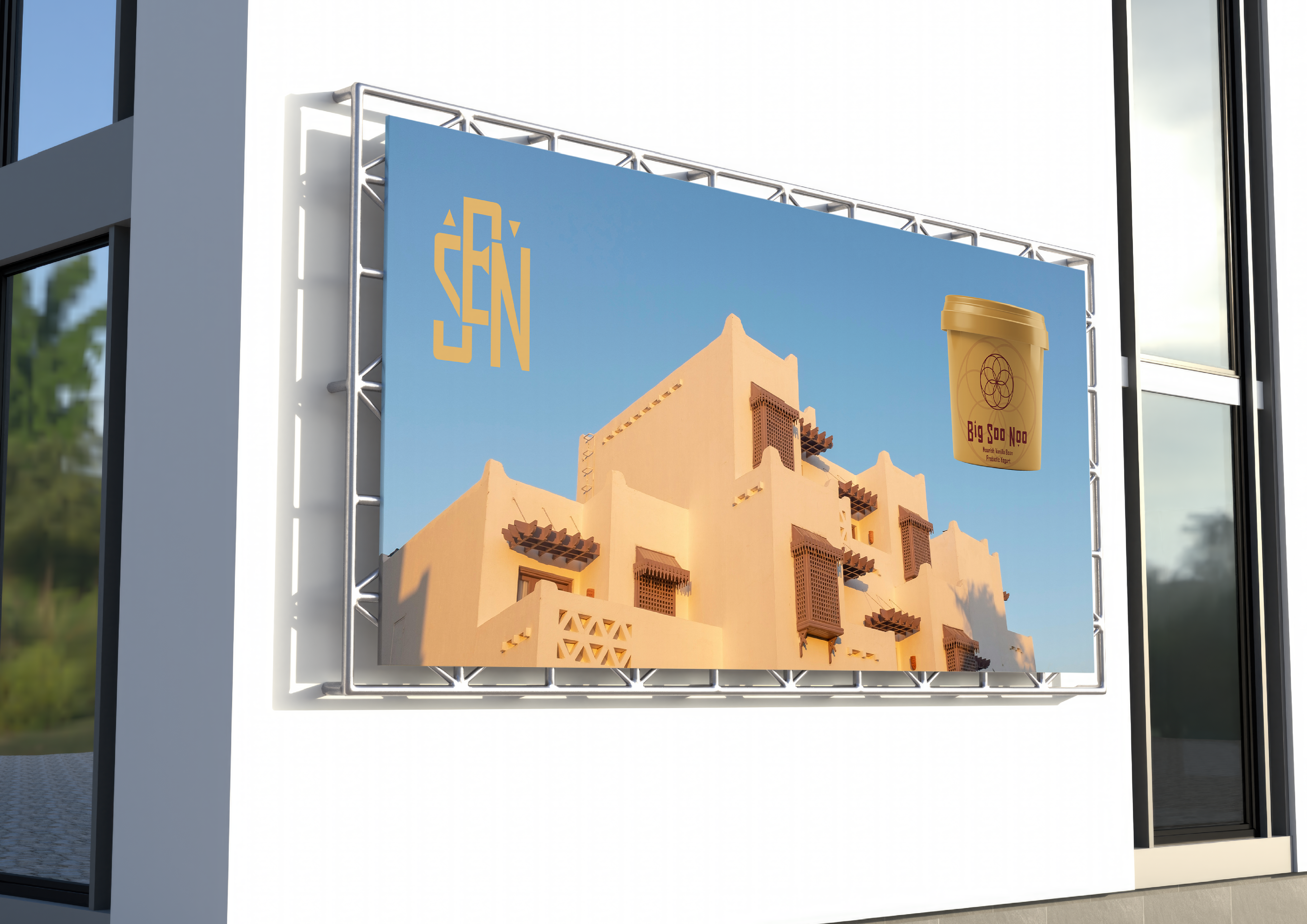
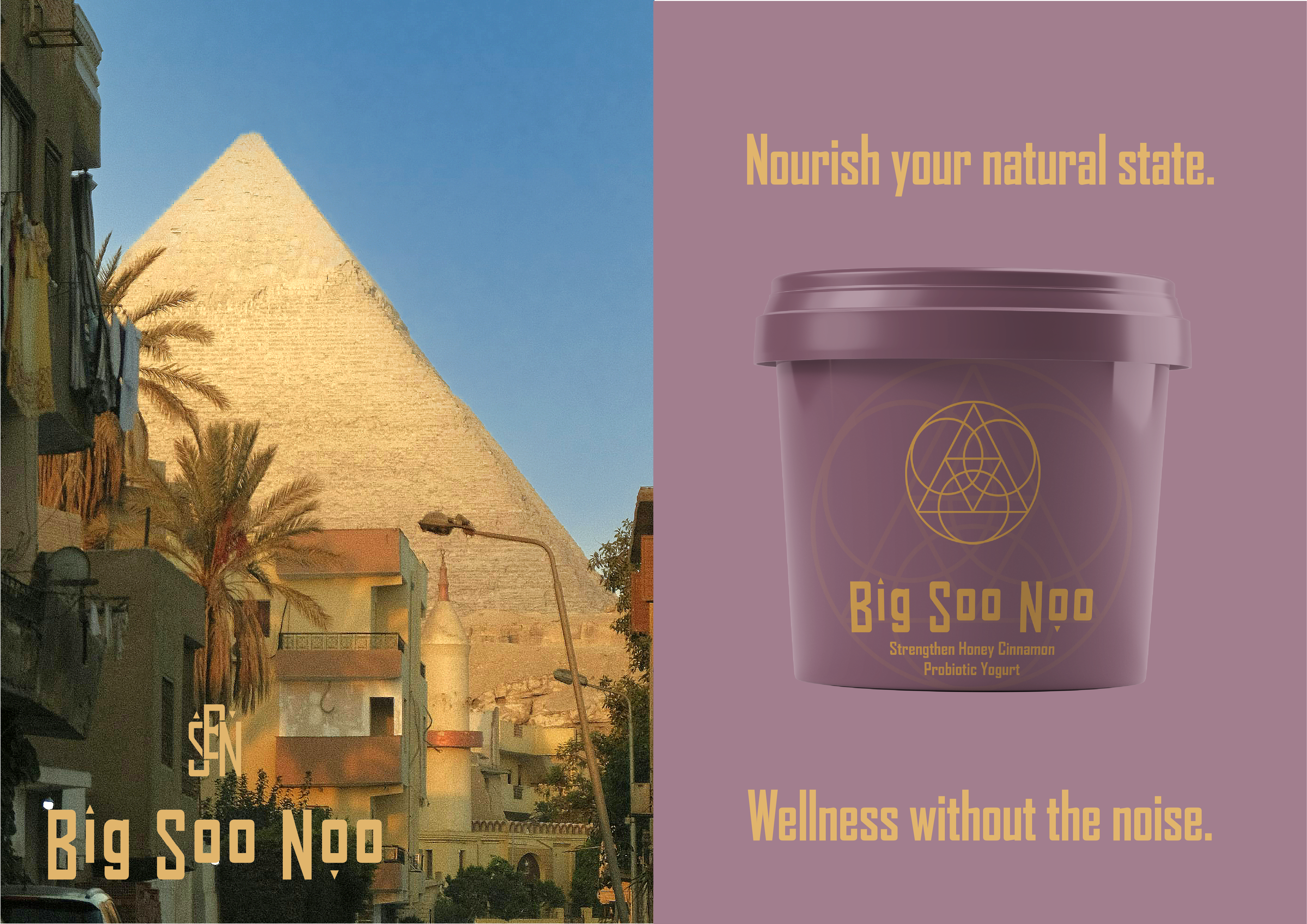
Wellness today is loud. Fast. Oversaturated. Promising everything and delivering very little. In a world of quick fixes and trend-driven formulas, balance has become a buzzword rather than a practice. Big Soo Noo was created as a return to structure, ritual, and intentional design. Inspired by ancient Egyptian healing philosophy and the principle of equilibrium between inner and outer worlds, the brand reframes wellbeing as a system rather than a solution.
This project explores how sacred geometry, architectural form, and subtle alchemical symbolism can shape a modern ritual brand without leaning into cliché. Through disciplined typography, a grounded yet warm palette, and packaging infused with symbolic references to transformation and energy, Big Soo Noo positions itself as a contemporary wellness brand built on timeless foundations. The result is an identity that feels considered, intelligent, and quietly powerful; less about noise, more about nourishment.
Scope
Brand Strategy
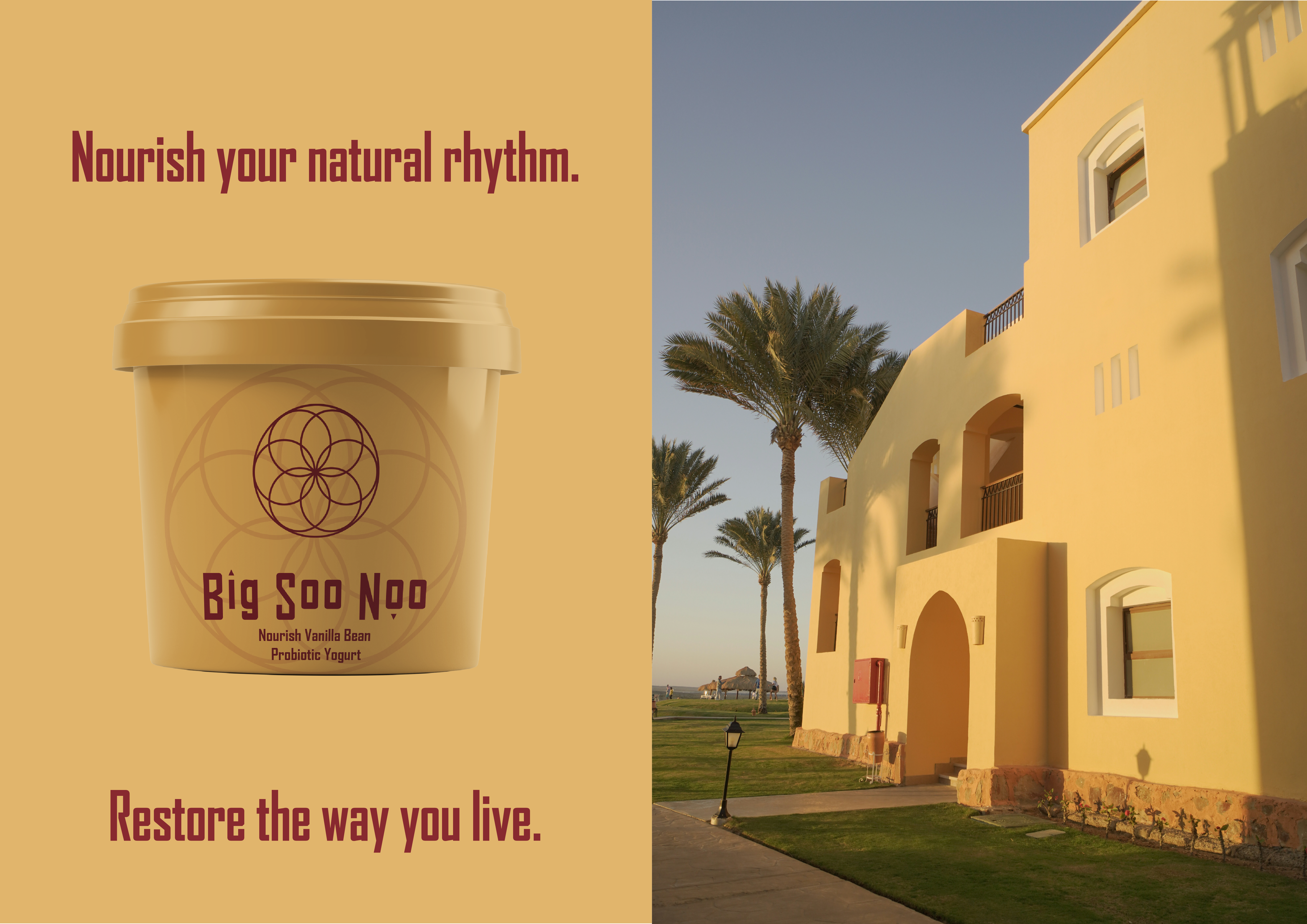
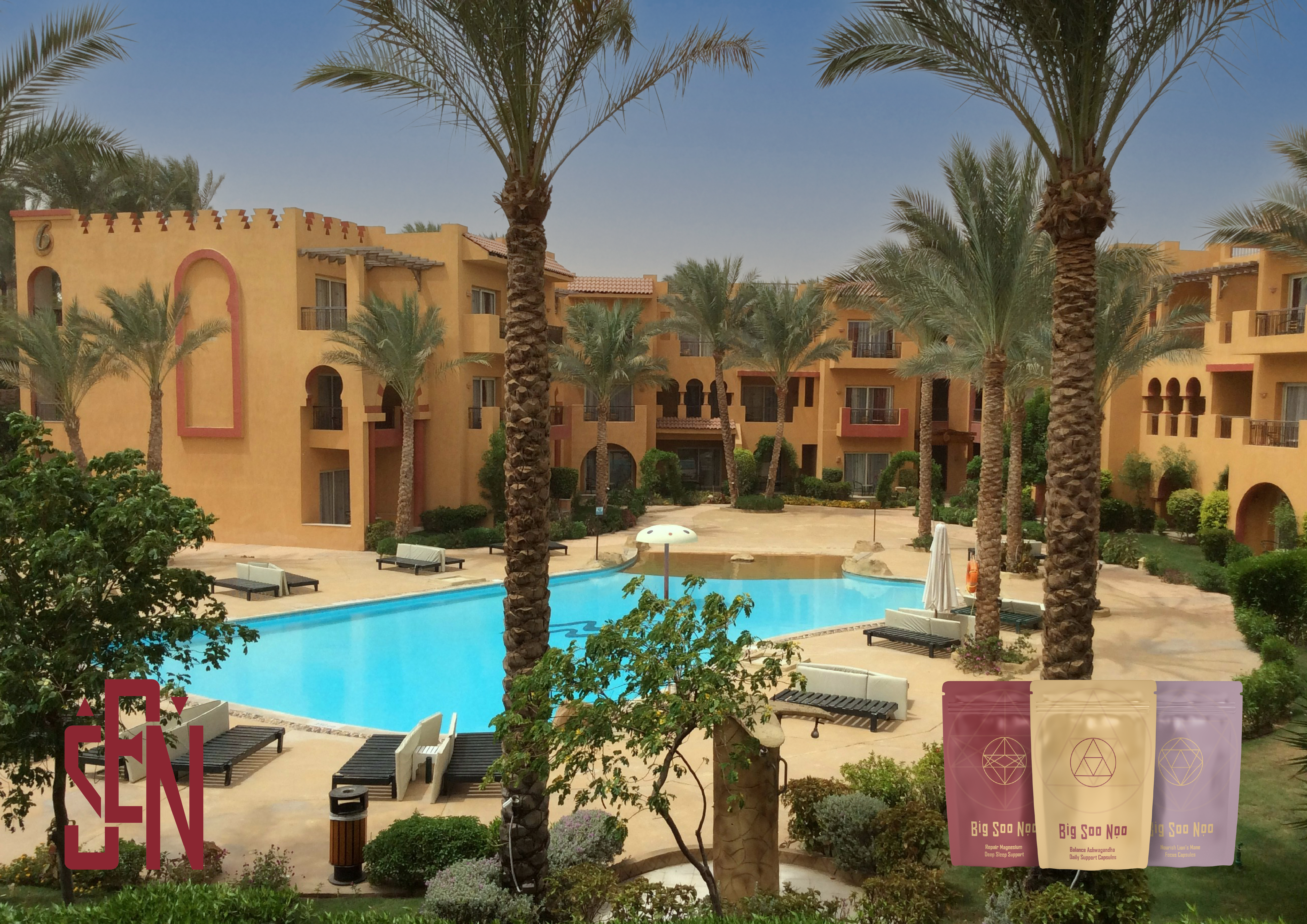
Visual Identity
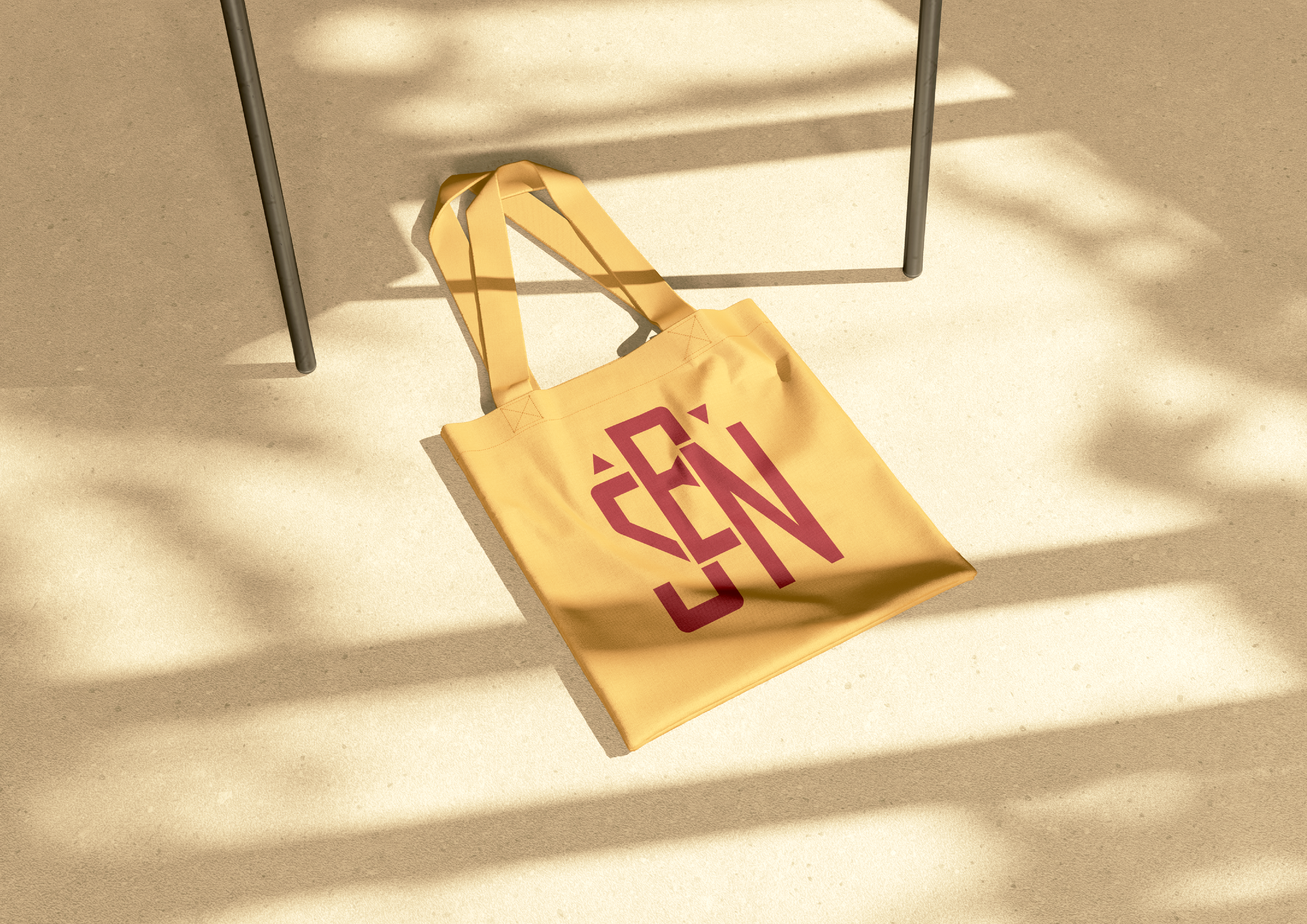
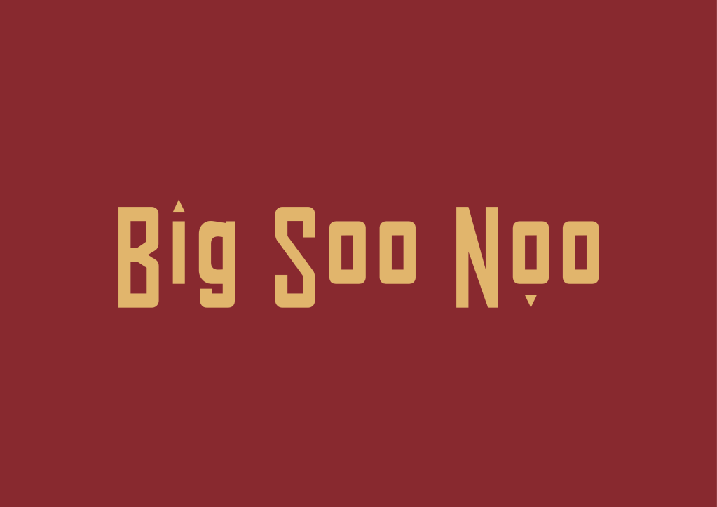
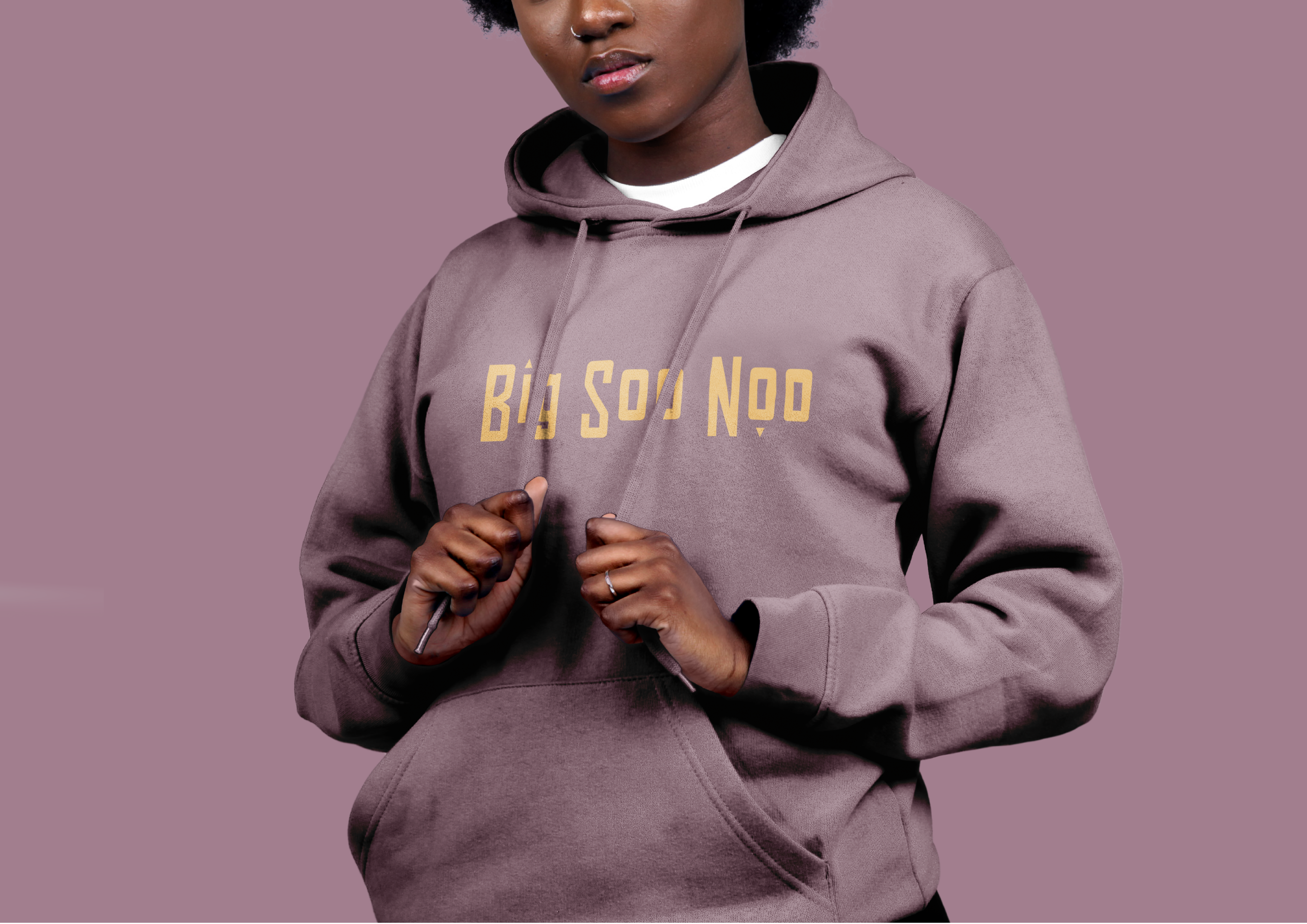
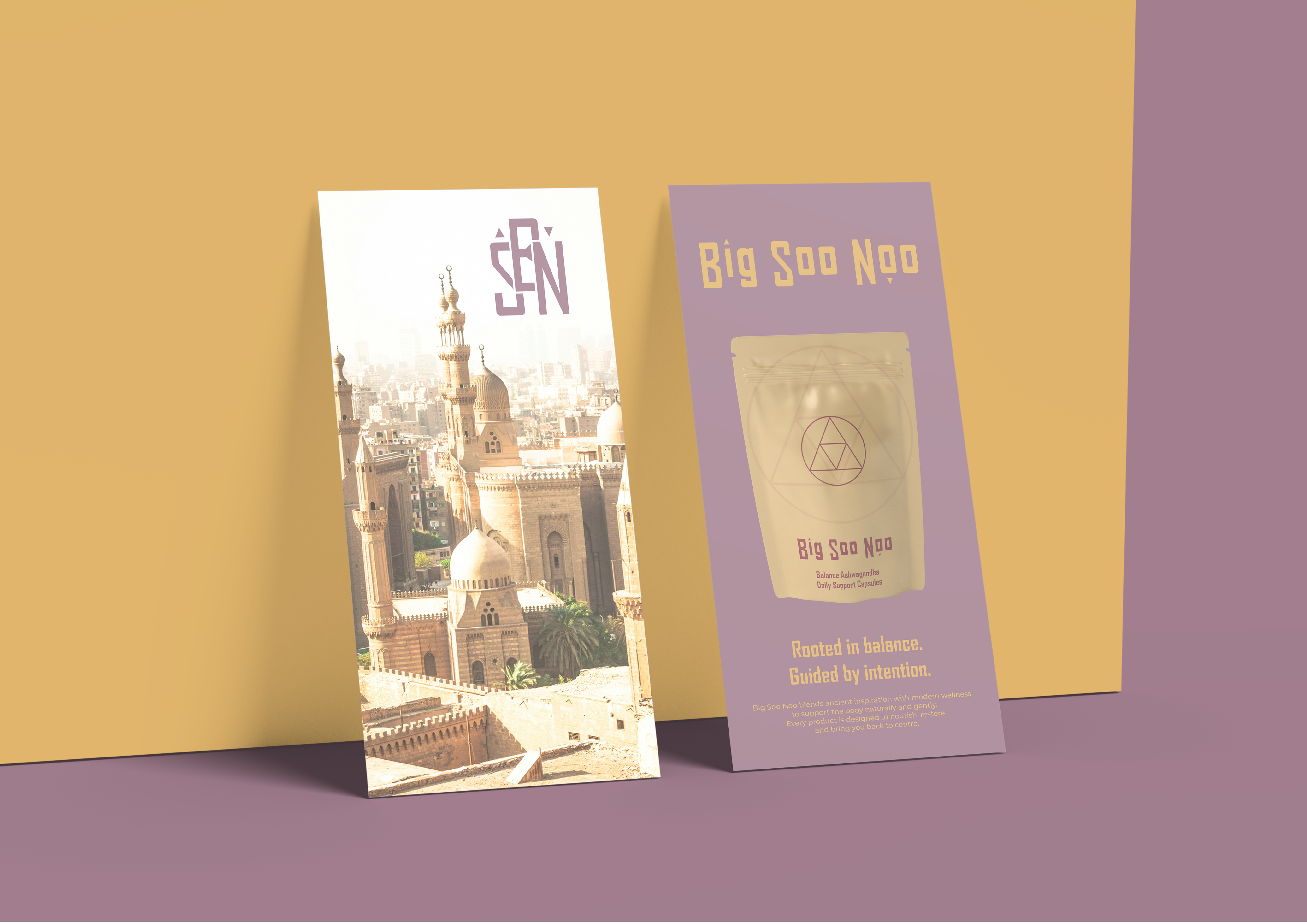
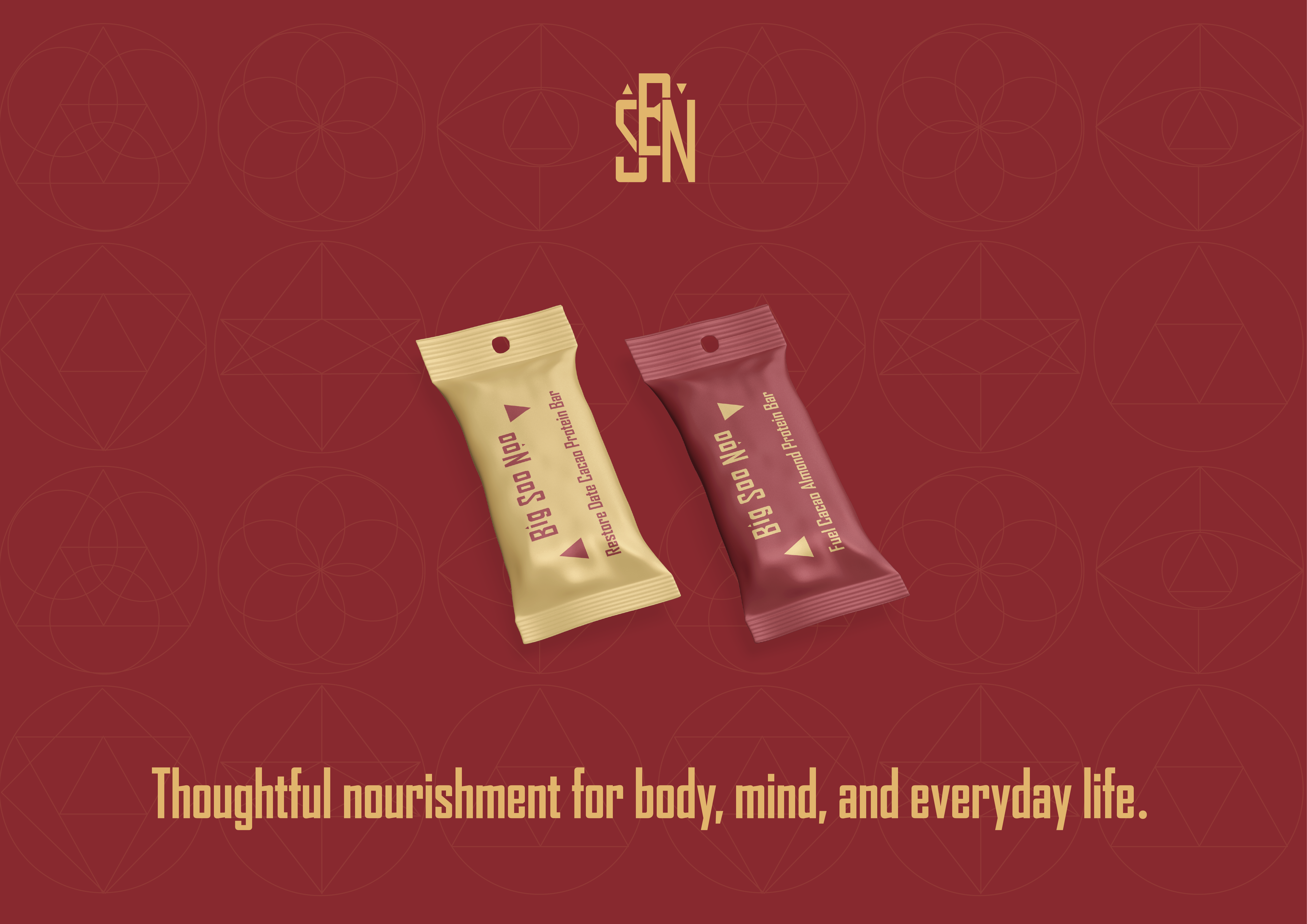
Logo Design
Typography System
Colour System
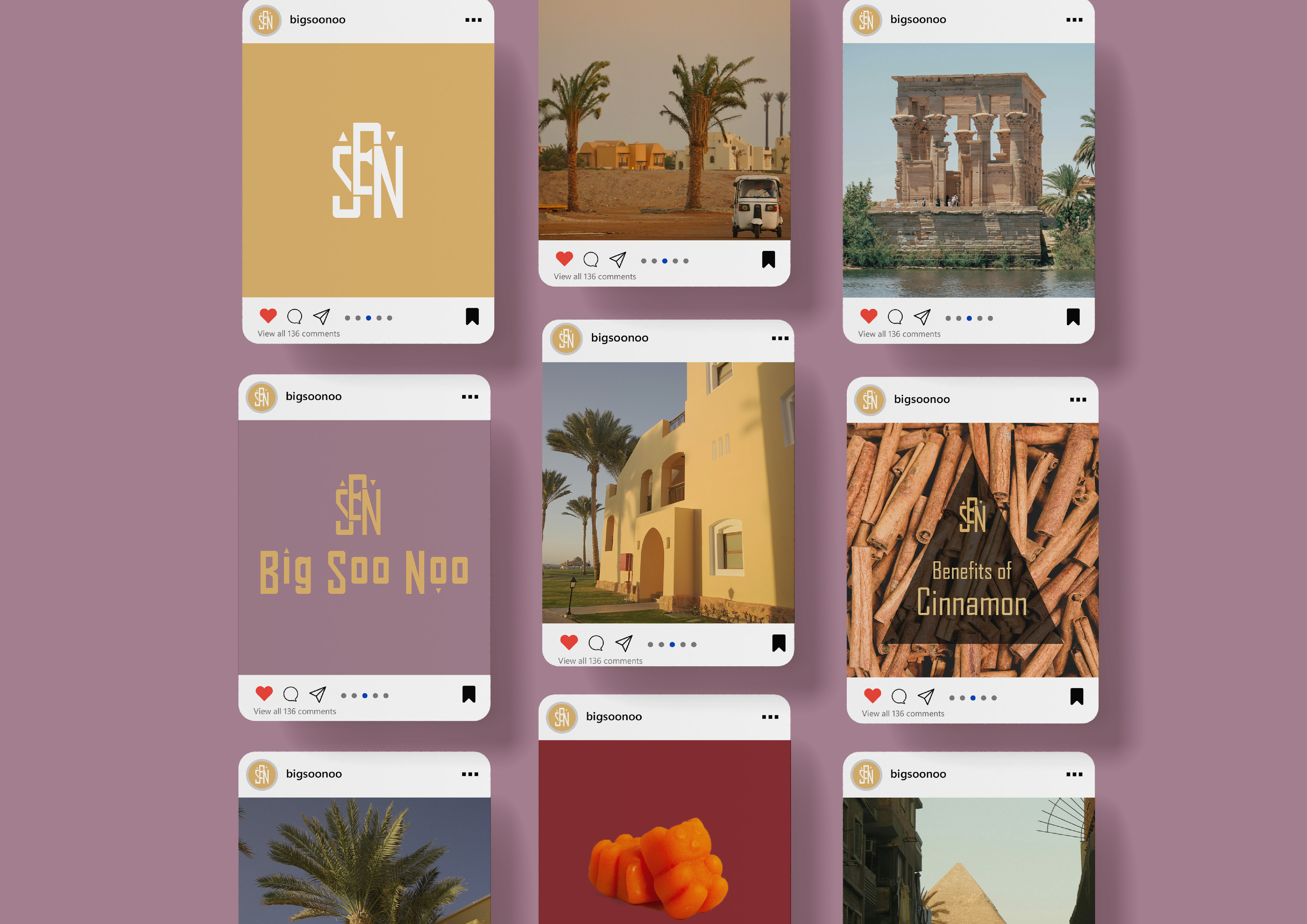
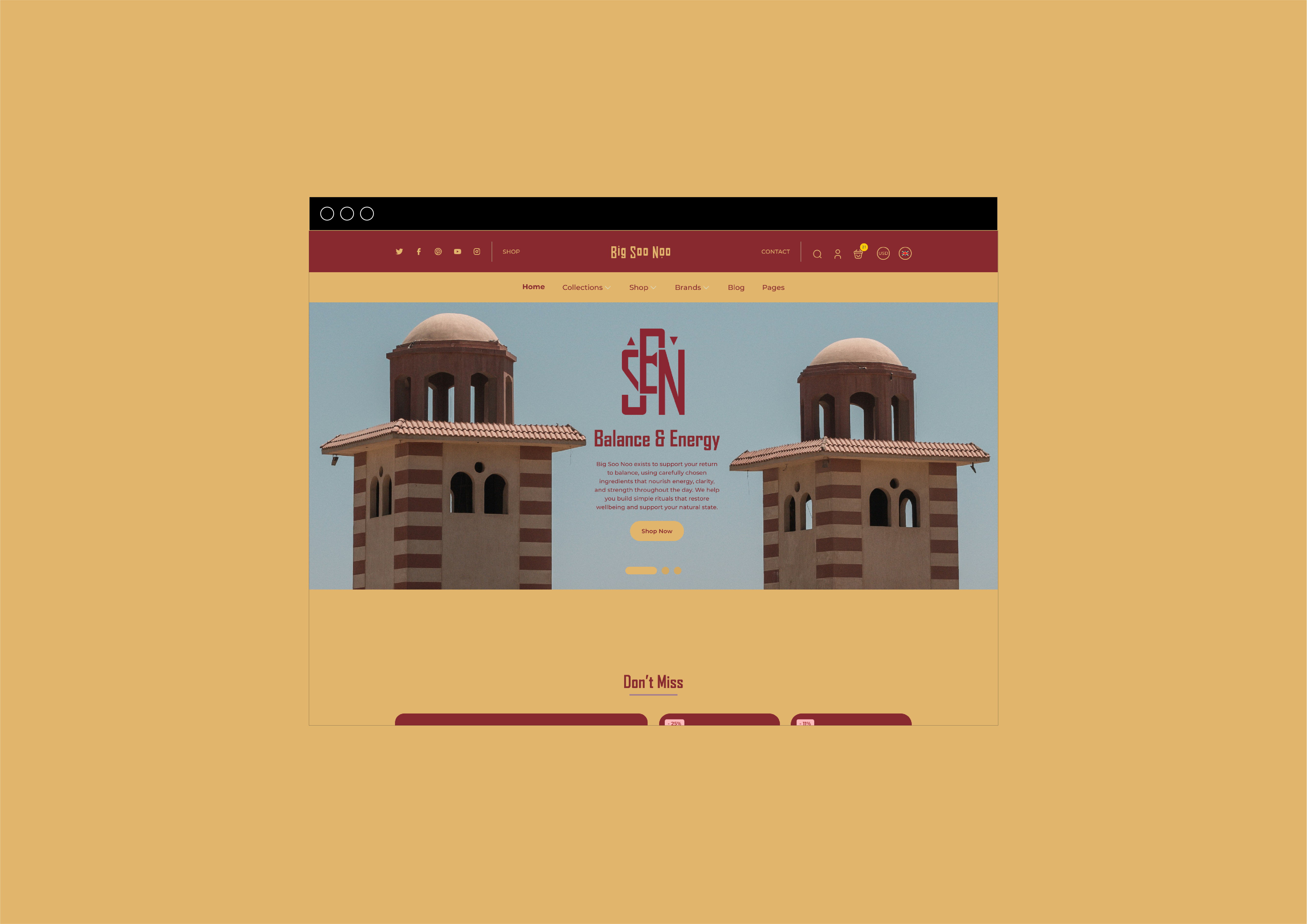
Homepage Design
UI Direction
Brand Guidelines
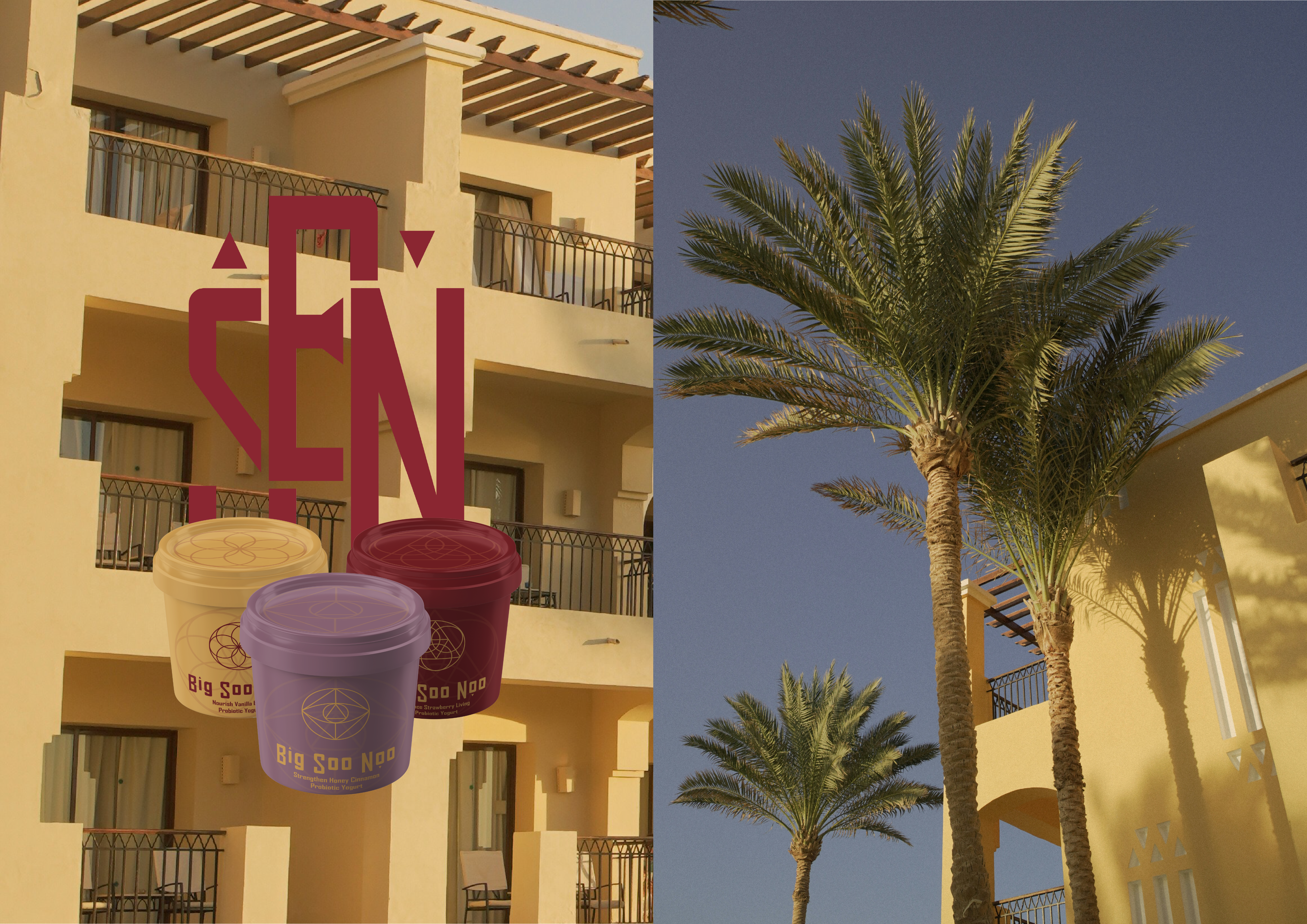
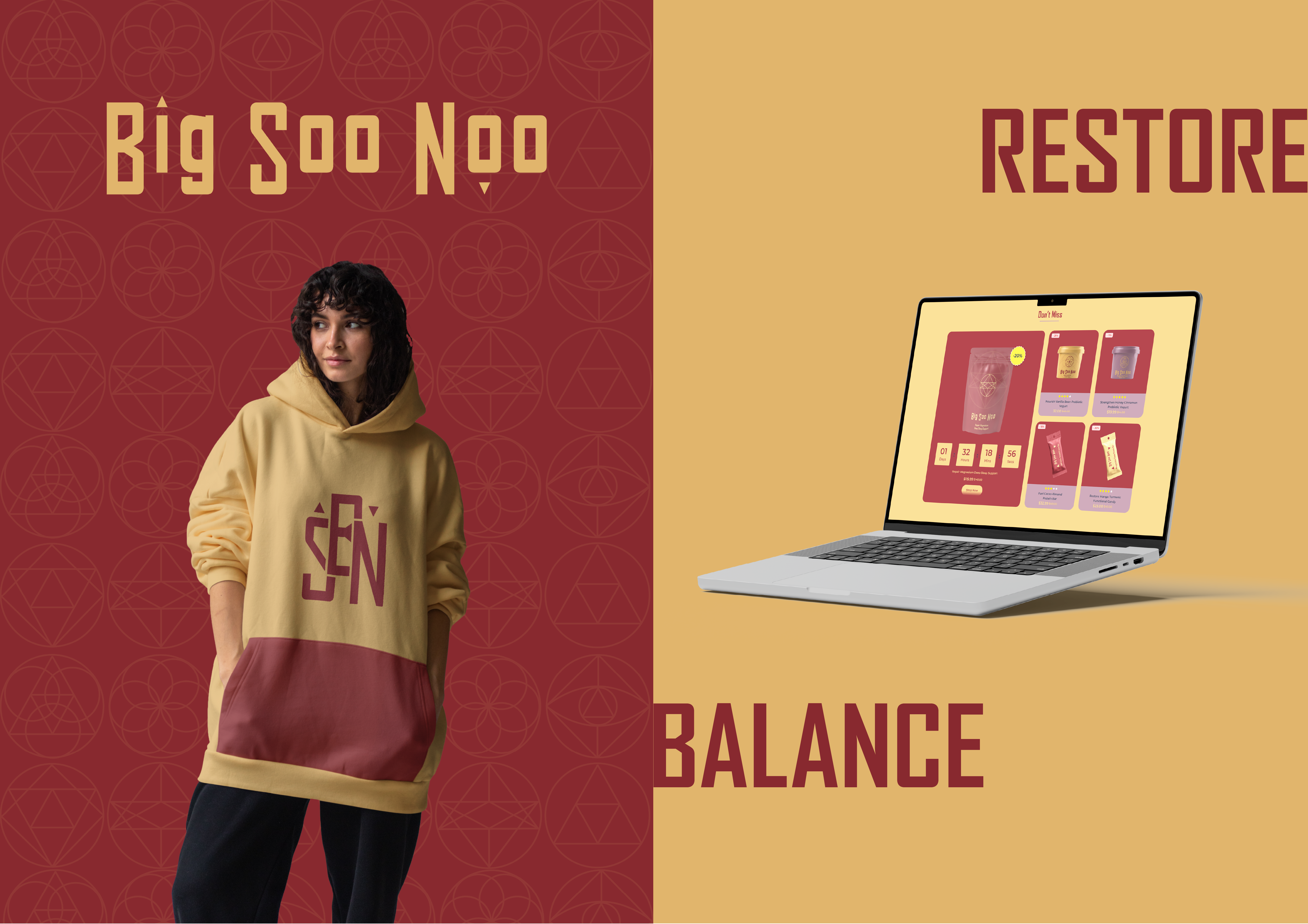
About Big Soo Noo
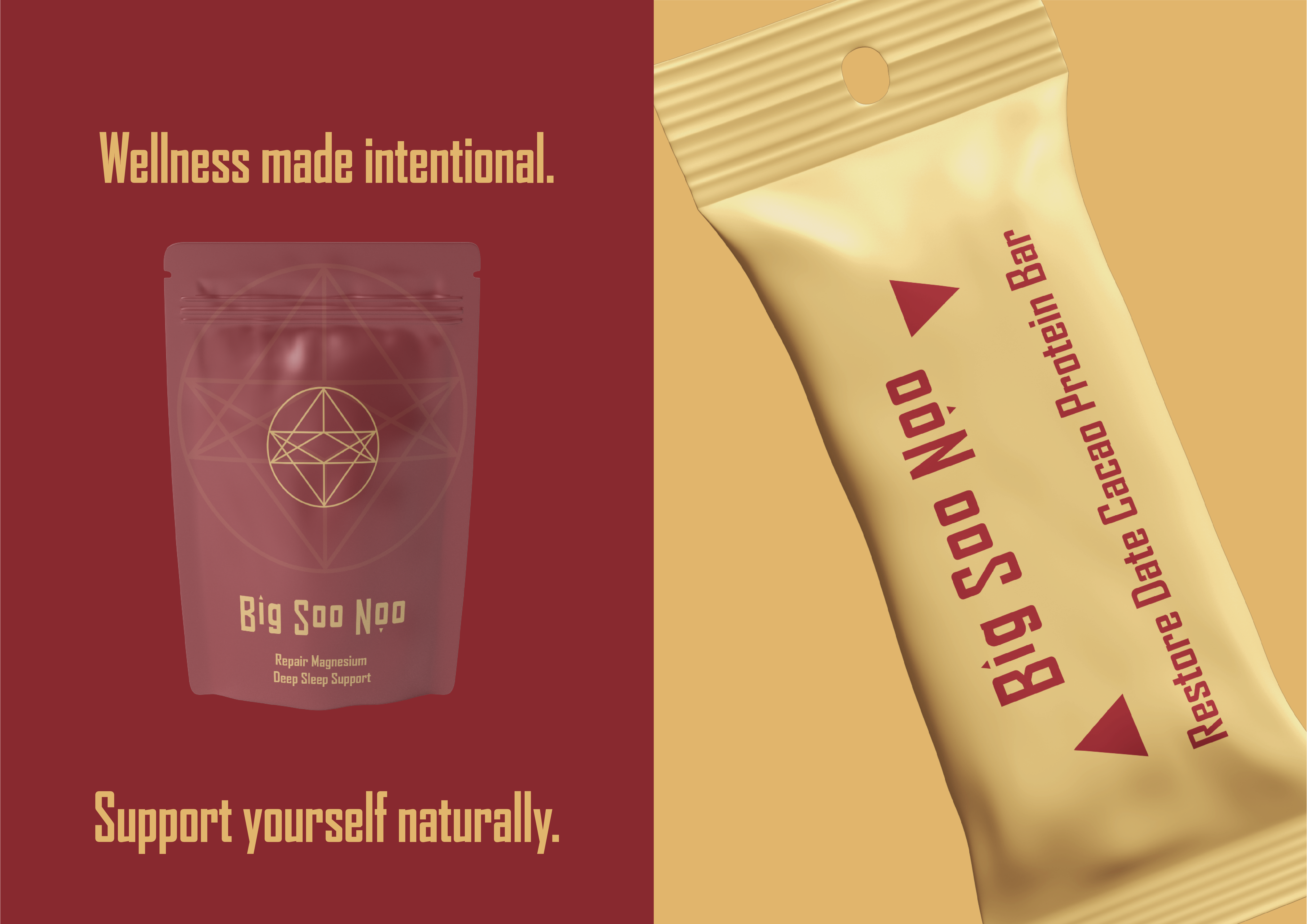
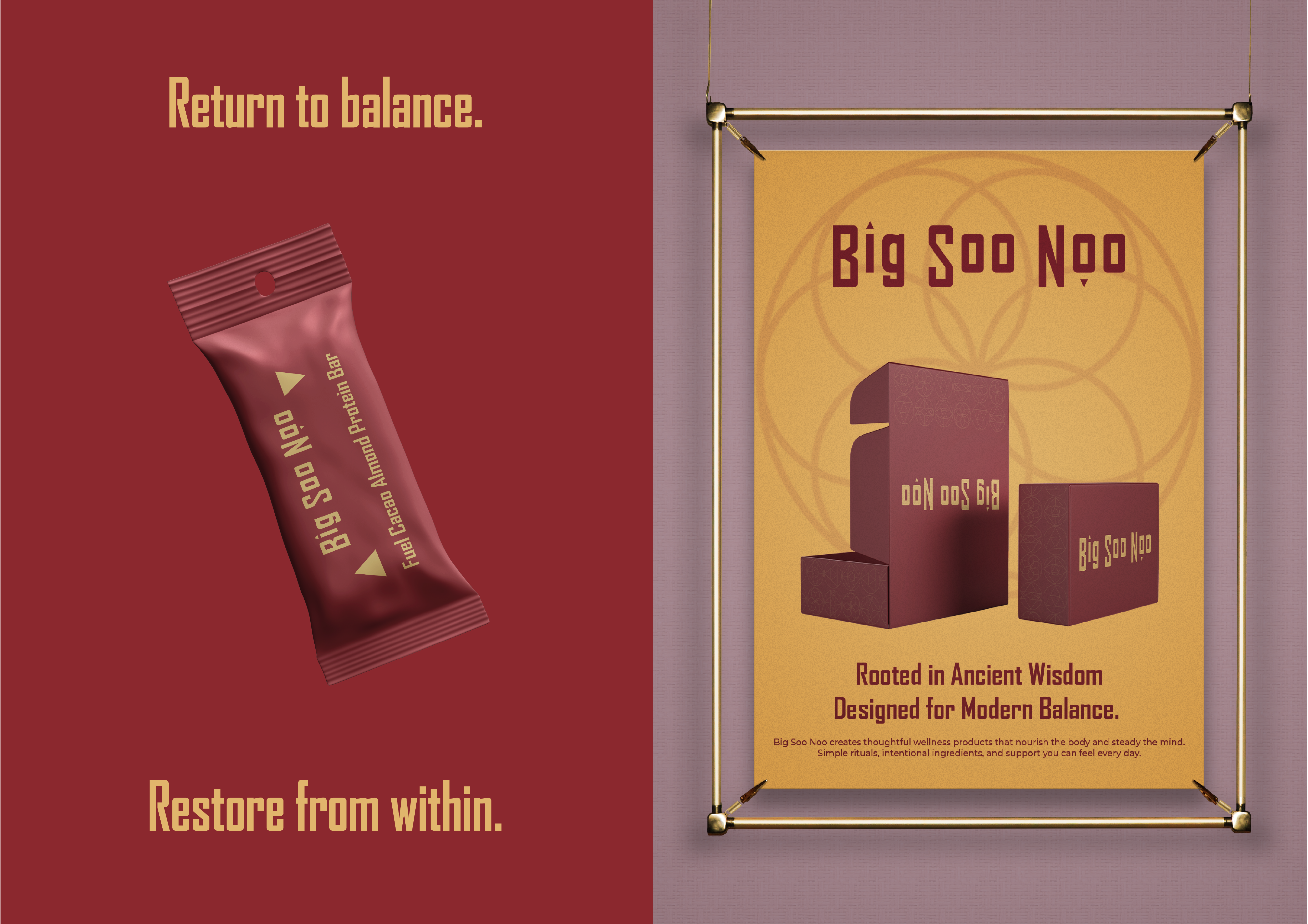
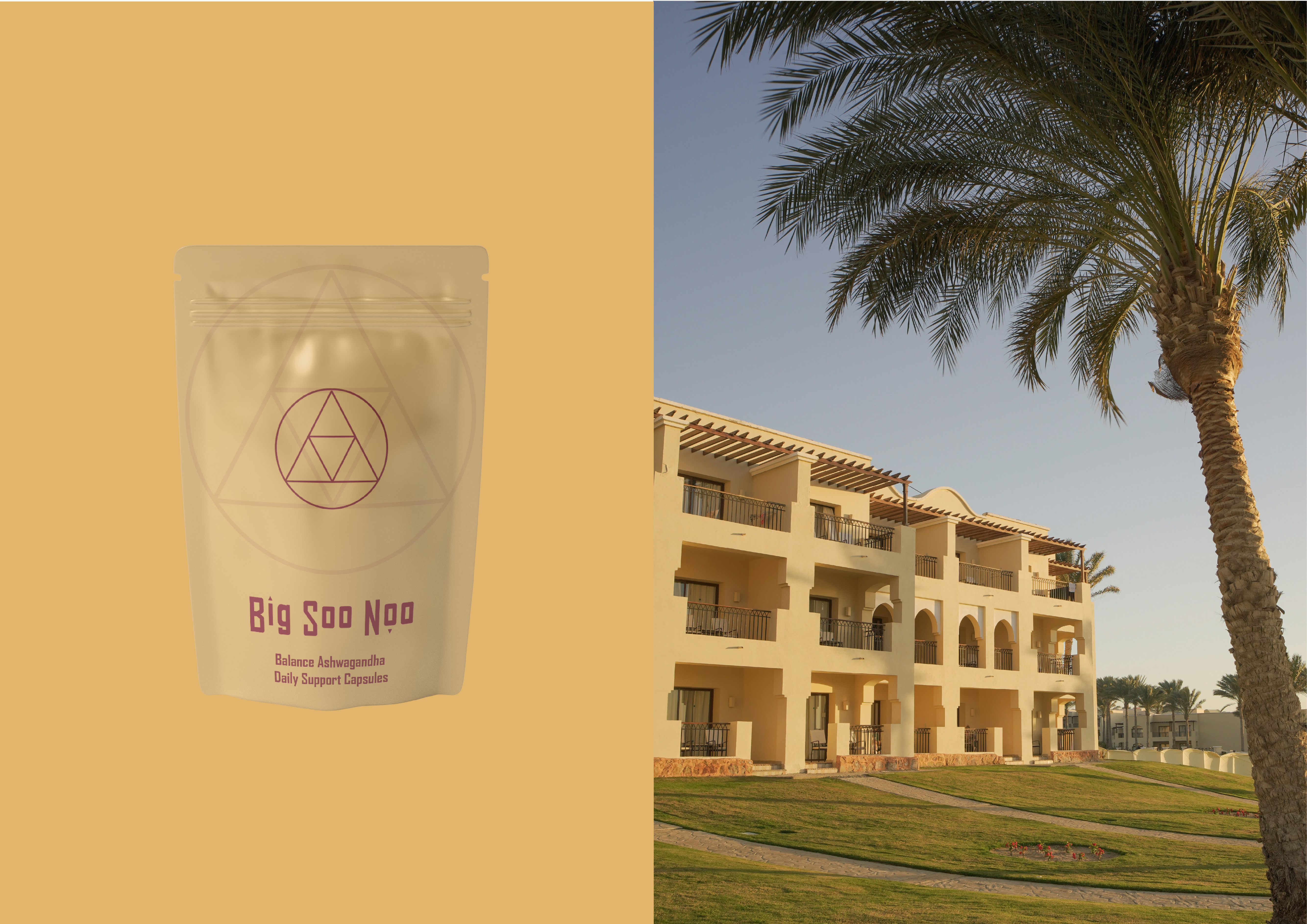
Big Soo Noo is a modern ritual brand rooted in ancient understanding. Inspired by early Egyptian healing philosophies, it brings balance, restoration, and nourishment into everyday life through functional food and supplements designed with intention. This is not wellness built on trends or noise; it is wellness shaped by systems, symbols, and structure. Drawing from sacred geometry and alchemical principles, the identity reflects the relationship between inner and outer balance, above and below, energy and matter. From the use of geometric forms to the integration of subtle alchemical symbols within the packaging, every detail signals a brand grounded in transformation and equilibrium. Big Soo Noo exists for those seeking steady energy, thoughtful nourishment, and a return to clarity in a world of excess.
Brand Voice
Big Soo Noo speaks with quiet confidence; warm, grounded, and assured. The voice is clear and intentional, never preachy, never overstated. It bridges ancient philosophy with modern clarity, translating sacred principles into language that feels accessible and human. Tone flexes between gently instructive when guiding daily rituals and softly affirming when reinforcing balance, nourishment, and restoration. The words are considered and spacious, mirroring the architectural strength of the visual identity.
Language across packaging, web, and social is designed as an extension of the brand system itself. Subtle references to equilibrium, transformation, and energy nod to the alchemical symbolism embedded within the packaging design. Copy avoids excess and trend-driven wellness jargon, favouring clarity over complexity and structure over spectacle. In Big Soo Noo’s world, language is not decoration; it is part of the ritual, reinforcing the relationship between what you consume and how you feel.

Design Approach
I set out to build Big Soo Noo as more than a wellness brand; I wanted to create a system rooted in structure, symbolism, and balance. The challenge was to translate ancient Egyptian healing philosophy into a contemporary identity that feels refined rather than referential. Instead of leaning into literal motifs, I focused on geometry, restraint, and architectural strength. The visual language is disciplined and intentional, reflecting the brand’s core belief in equilibrium between inner and outer wellbeing.
Across packaging and brand assets, I incorporated sacred geometry and subtle alchemical symbols to reference transformation and energetic balance without becoming overt. The colour palette was carefully composed to feel grounded yet warm, while bold typography creates presence and clarity. Every element, from the structured logo mark to the patterned applications, reinforces the principle of “as above, so below” and positions Big Soo Noo as a modern ritual brand built on timeless foundations