Luxury skincare often leans toward clinical minimalism or loud indulgence. Rarely does it achieve both refinement and responsibility in equal measure. Bare Cheeky was created to bridge that space; where conscious consumption meets lavish self-care. Rooted in organic formulation and handcrafted in small batches in Manchester, the brand champions plastic-free packaging and vegan integrity without compromising on glamour or performance.
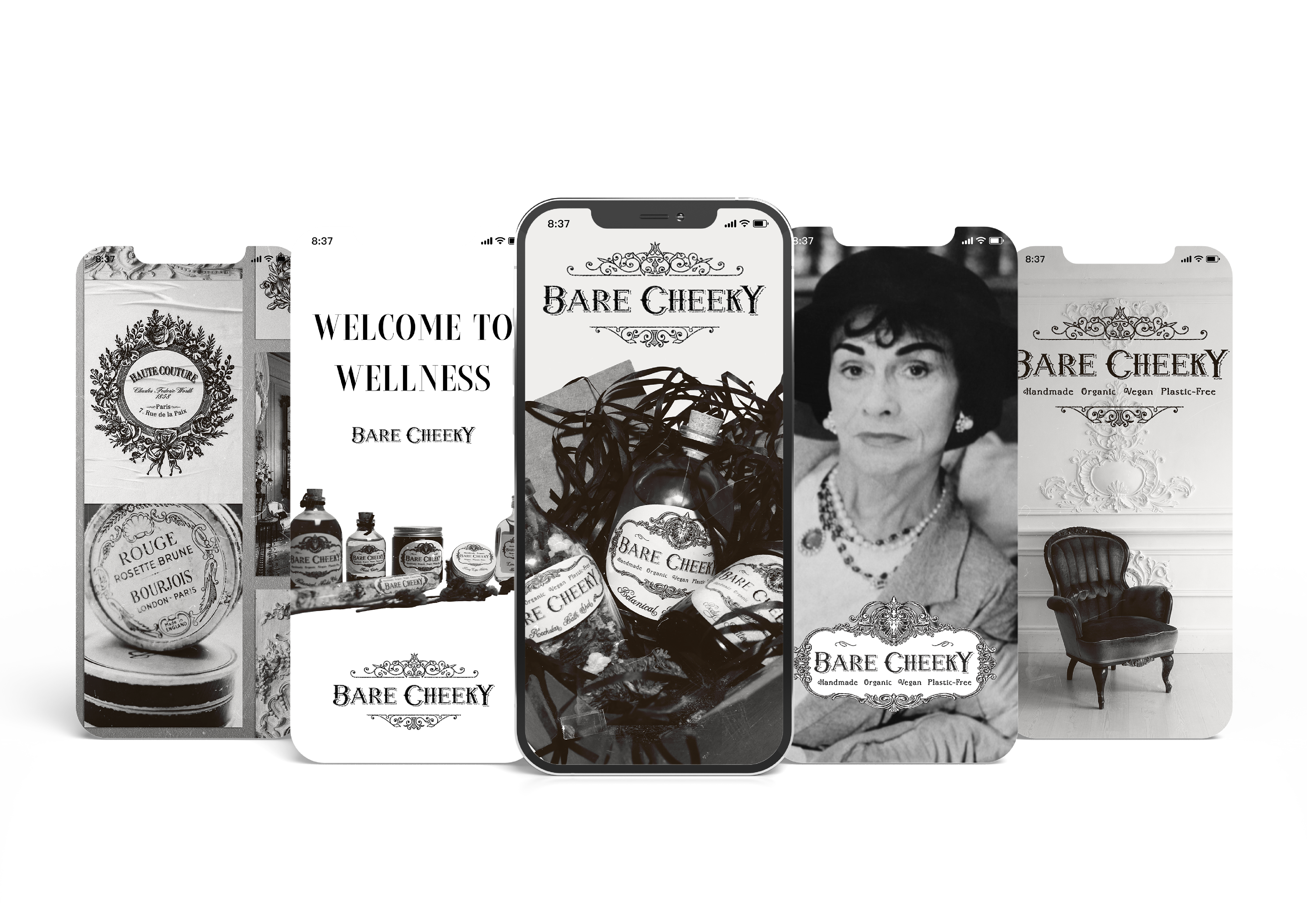
Inspired by vintage French apothecaries, botanical rituals, and the timeless elegance of women who age beautifully, Bare Cheeky embodies a slower, more intentional approach to skincare. This project sought to translate that ethos into a cohesive brand identity that feels nostalgic yet modern, indulgent yet grounded, refined yet accessible.
Scope
Brand Identity
Art Direction
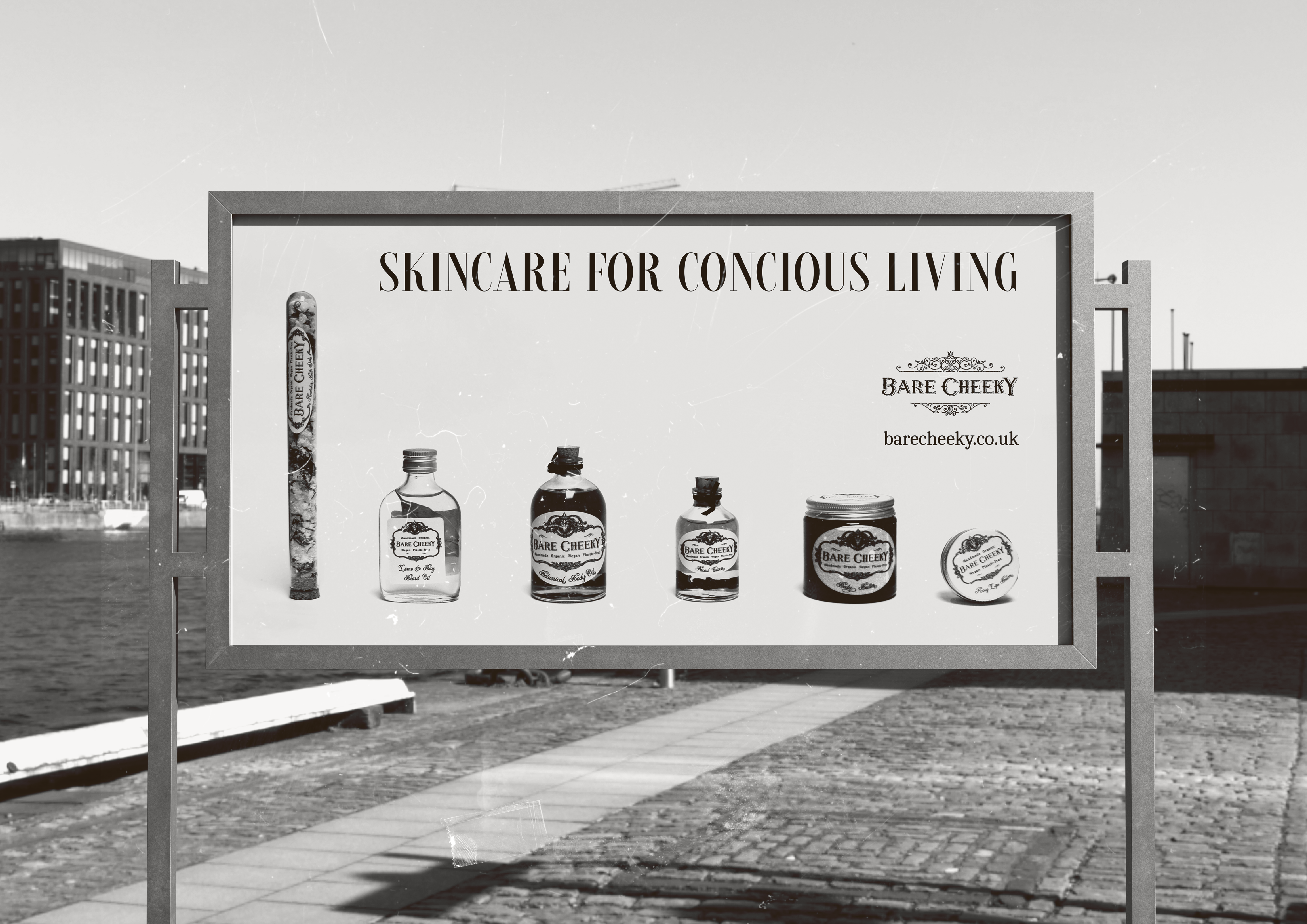
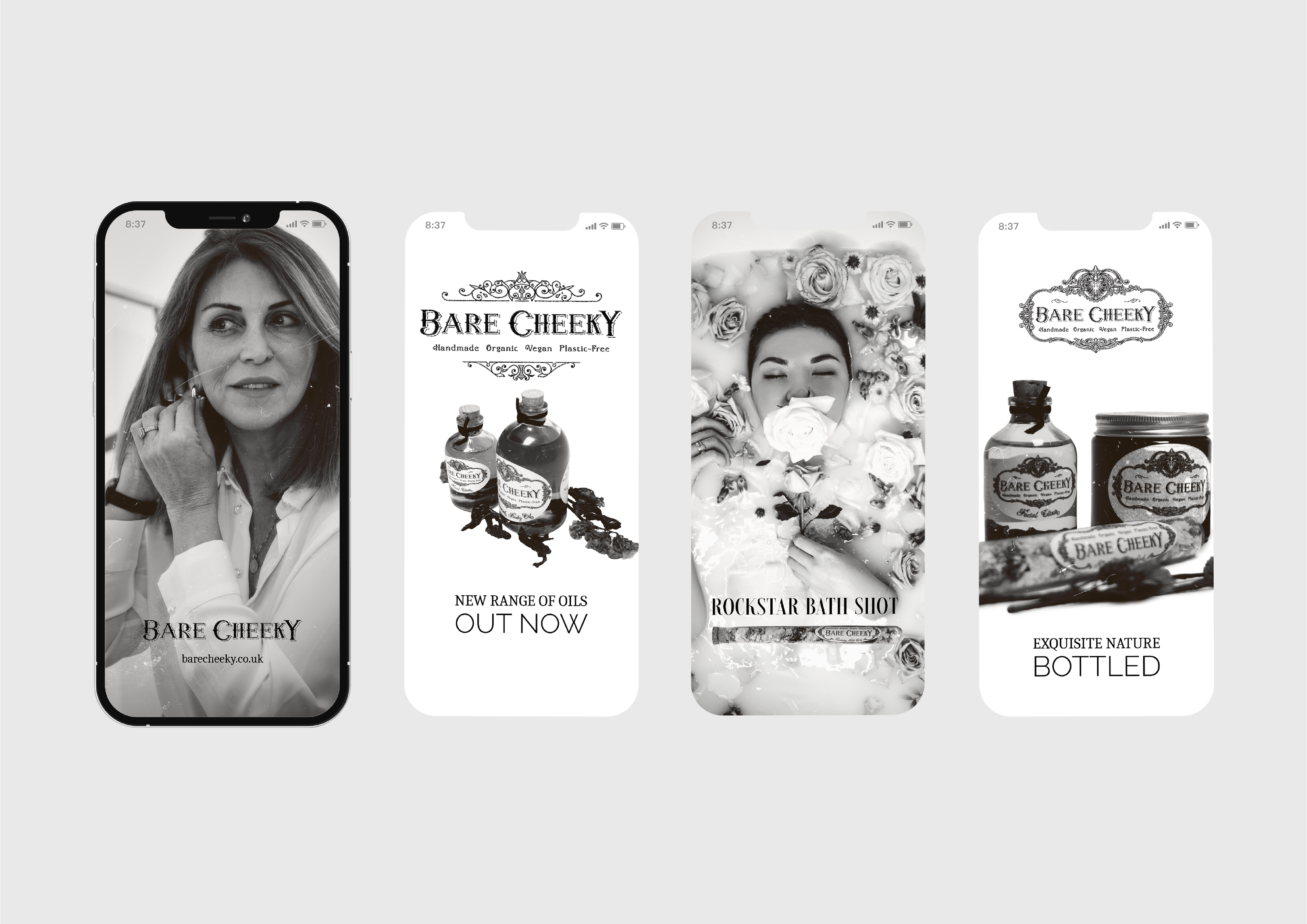
Packaging Labels
Price List Design
Copywriting
Product Photography
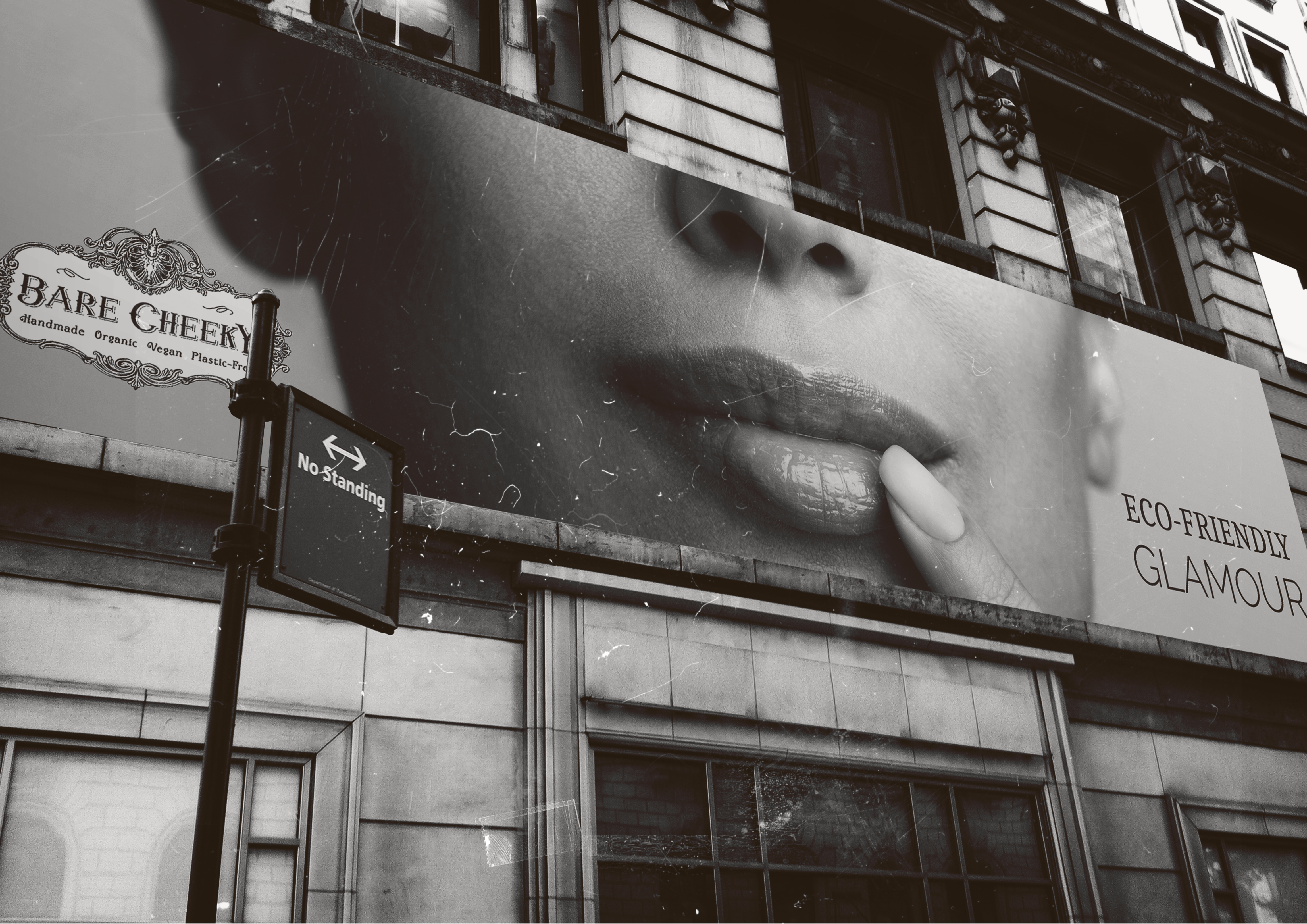
About Bare Cheeky
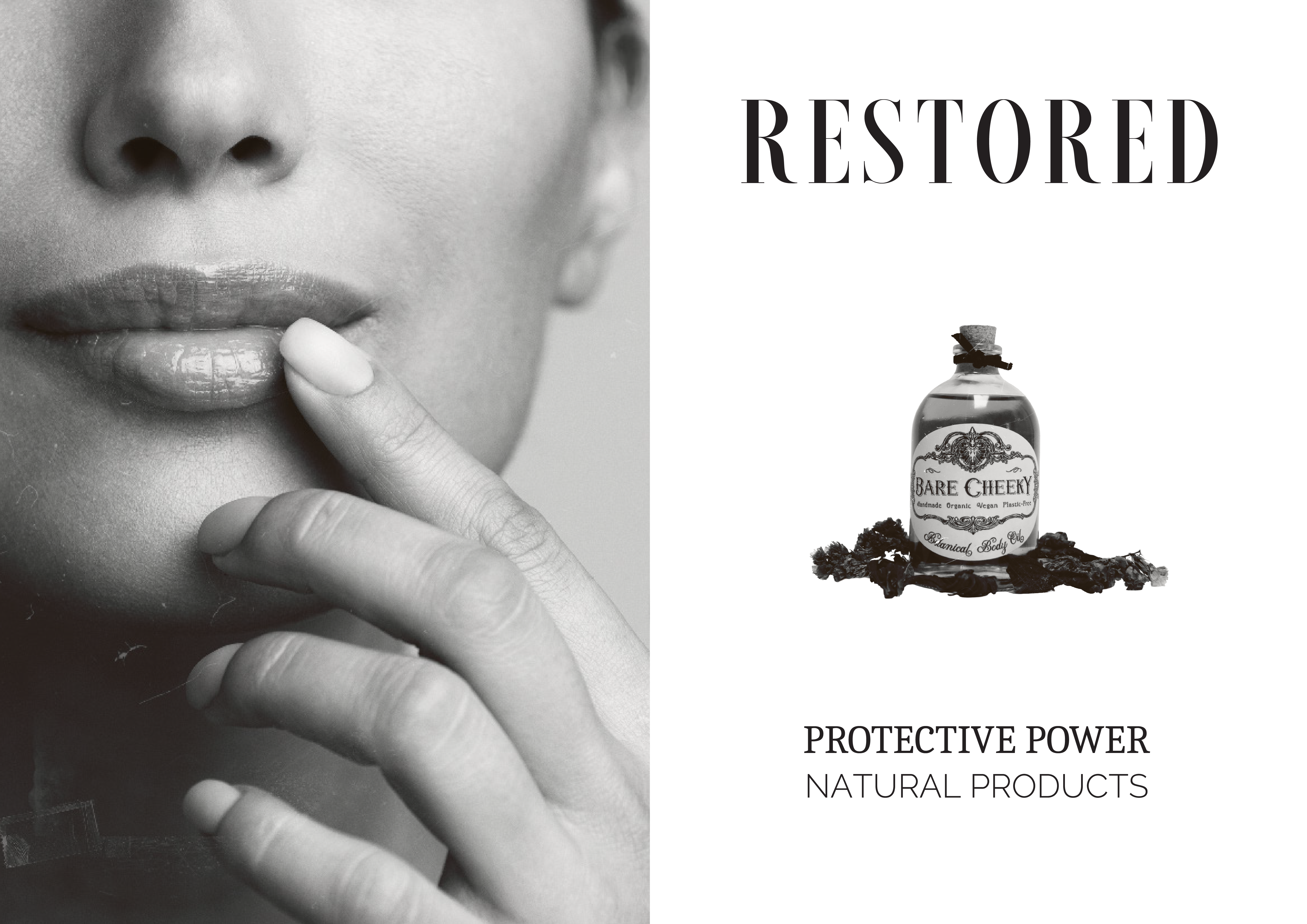
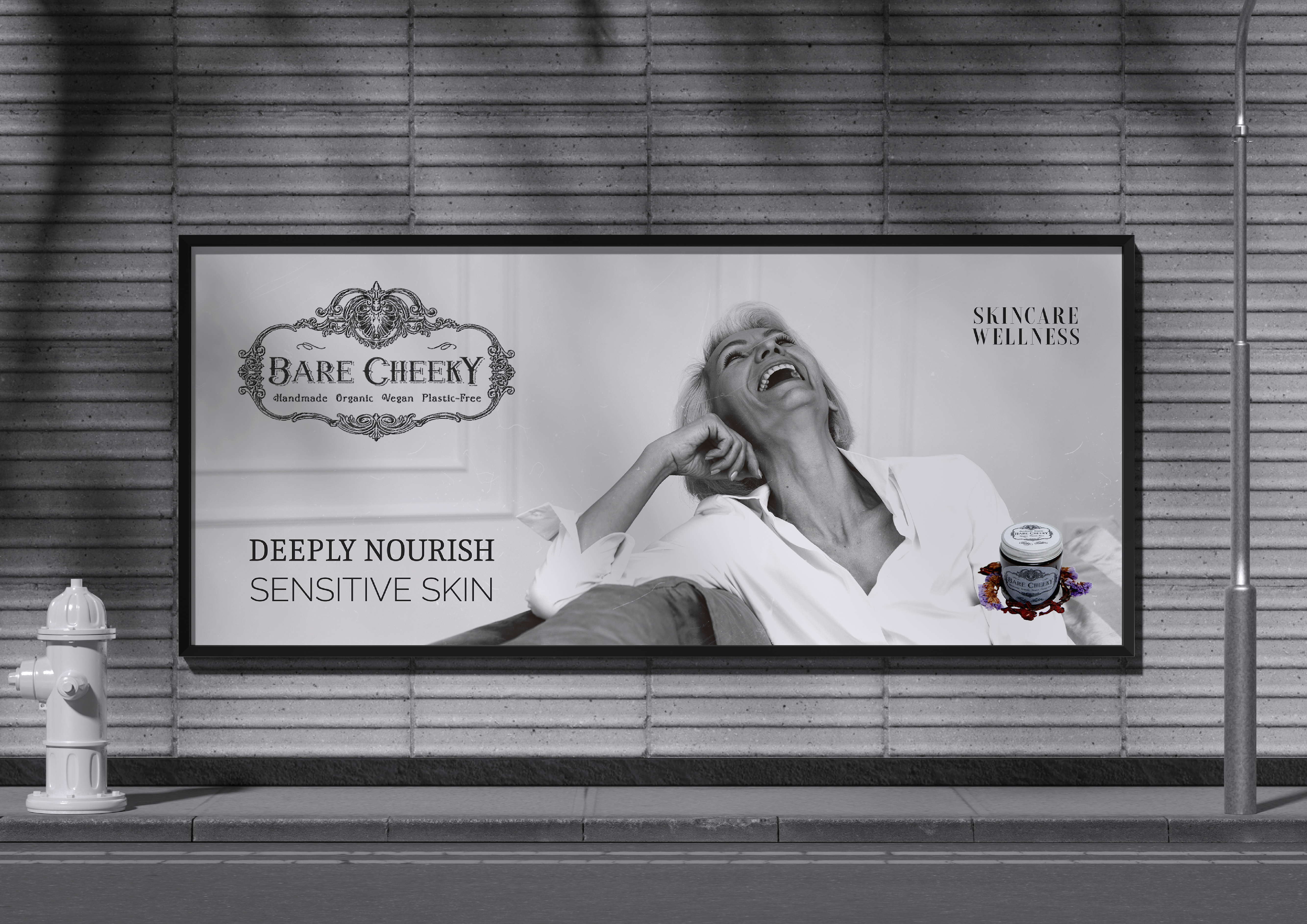
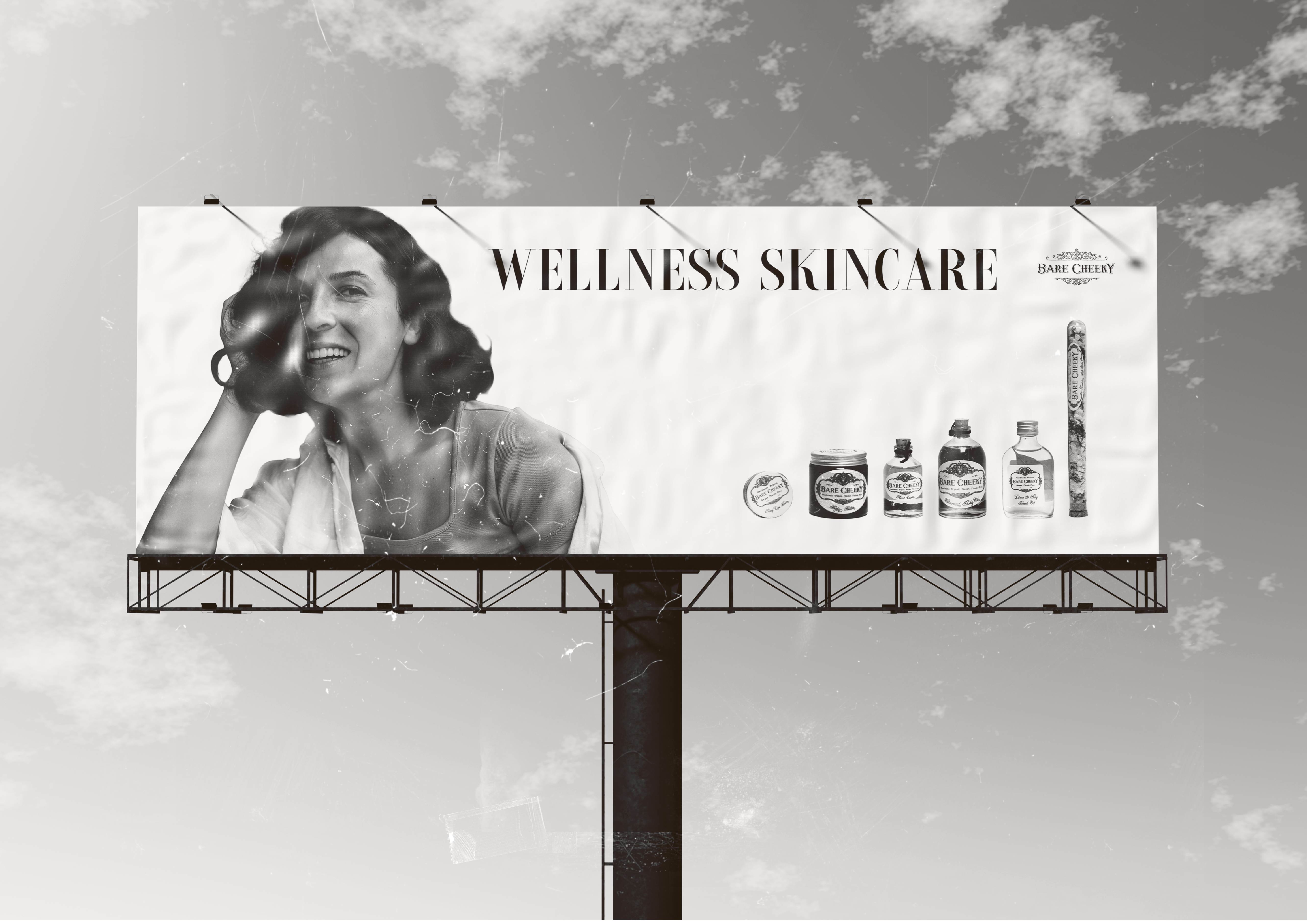
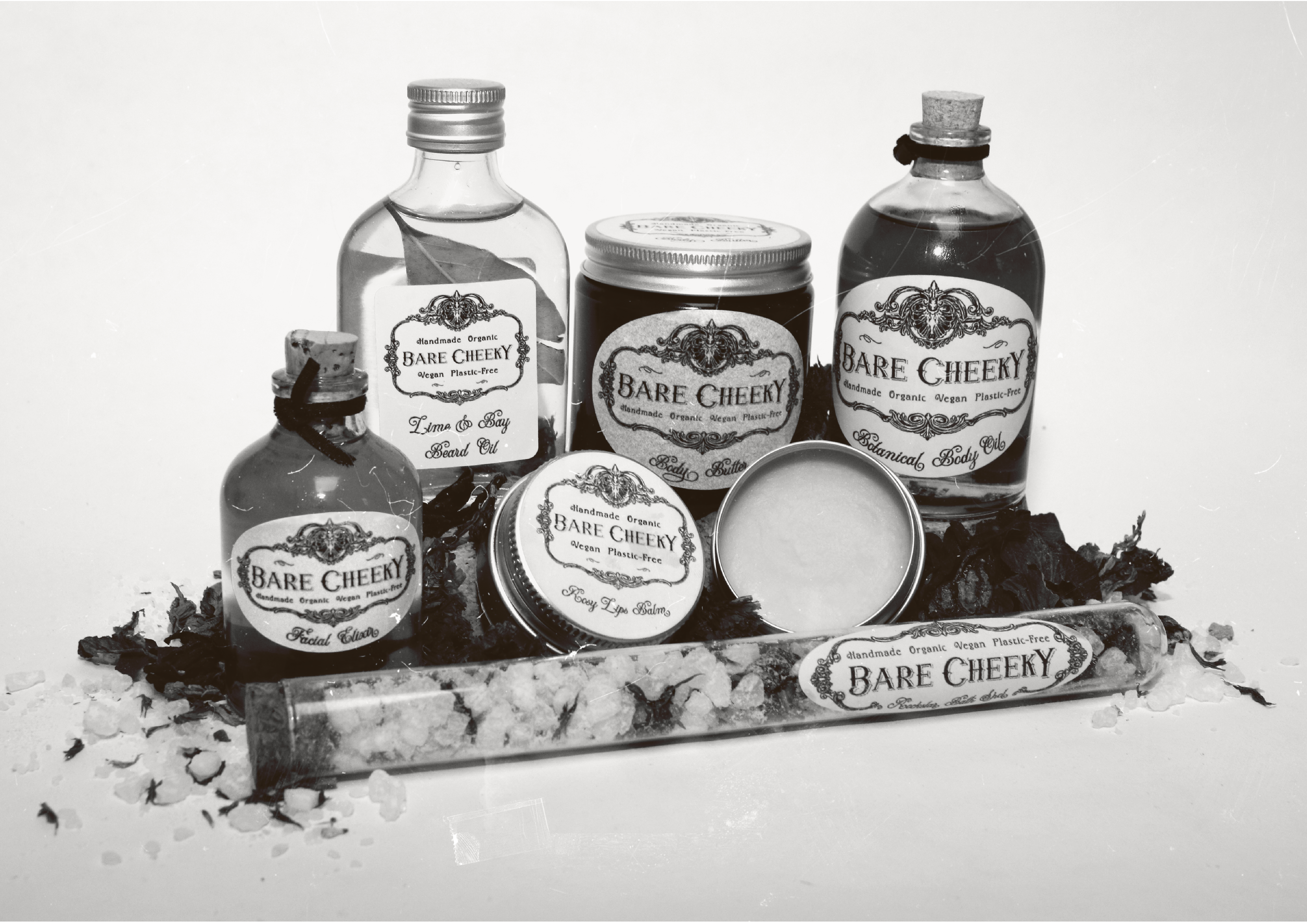
Bare Cheeky is a modern apothecary brand with an old soul. Born from a desire to create organic, vegan skincare that feels both luxurious and responsible, it exists for women who value self-worth as much as sustainability. Handmade in Manchester and inspired by Ayurvedic ritual, the brand merges holistic wellbeing with feminine elegance. From richly blended body butters to transformative facial elixirs, each product is crafted to nourish sensitive skin while honouring the planet.
With vintage-inspired frames, French-influenced typography, and plastic-free packaging, Bare Cheeky signals a return to romance in skincare. It is indulgence without excess, glamour without waste, and ritual without pretence. More than a product range, it is a celebration of conscious beauty and timeless self-care.
Design Approach
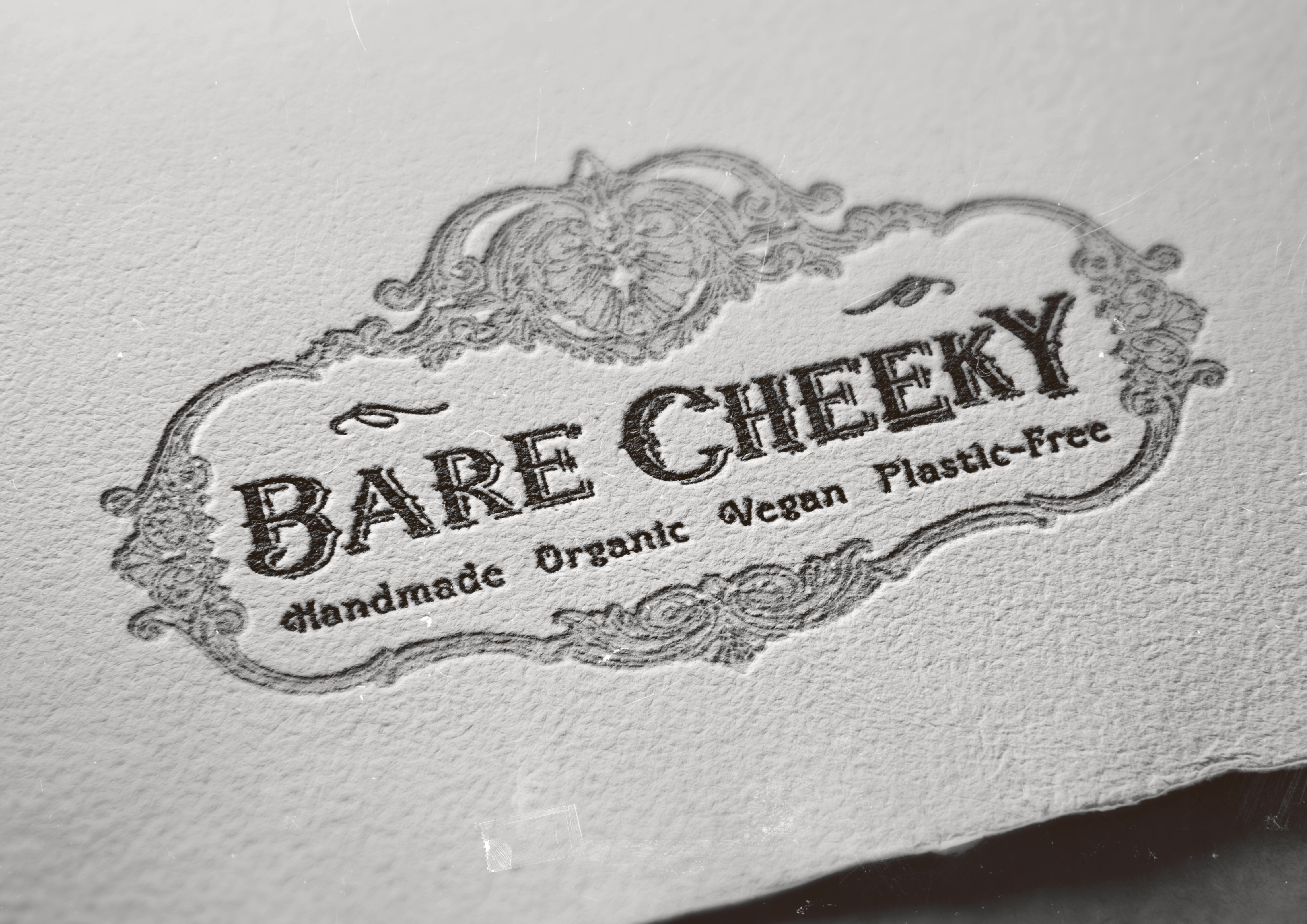
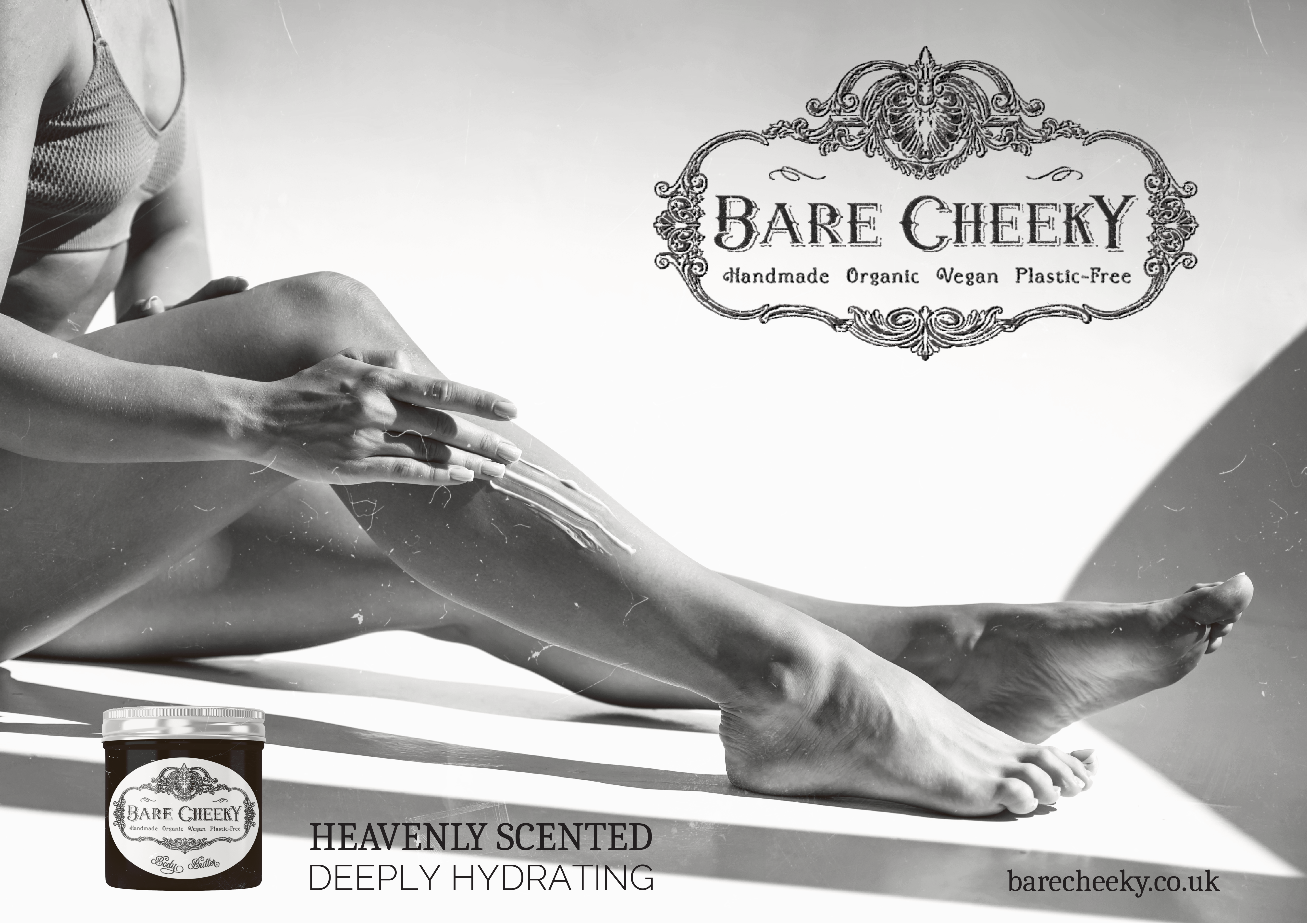
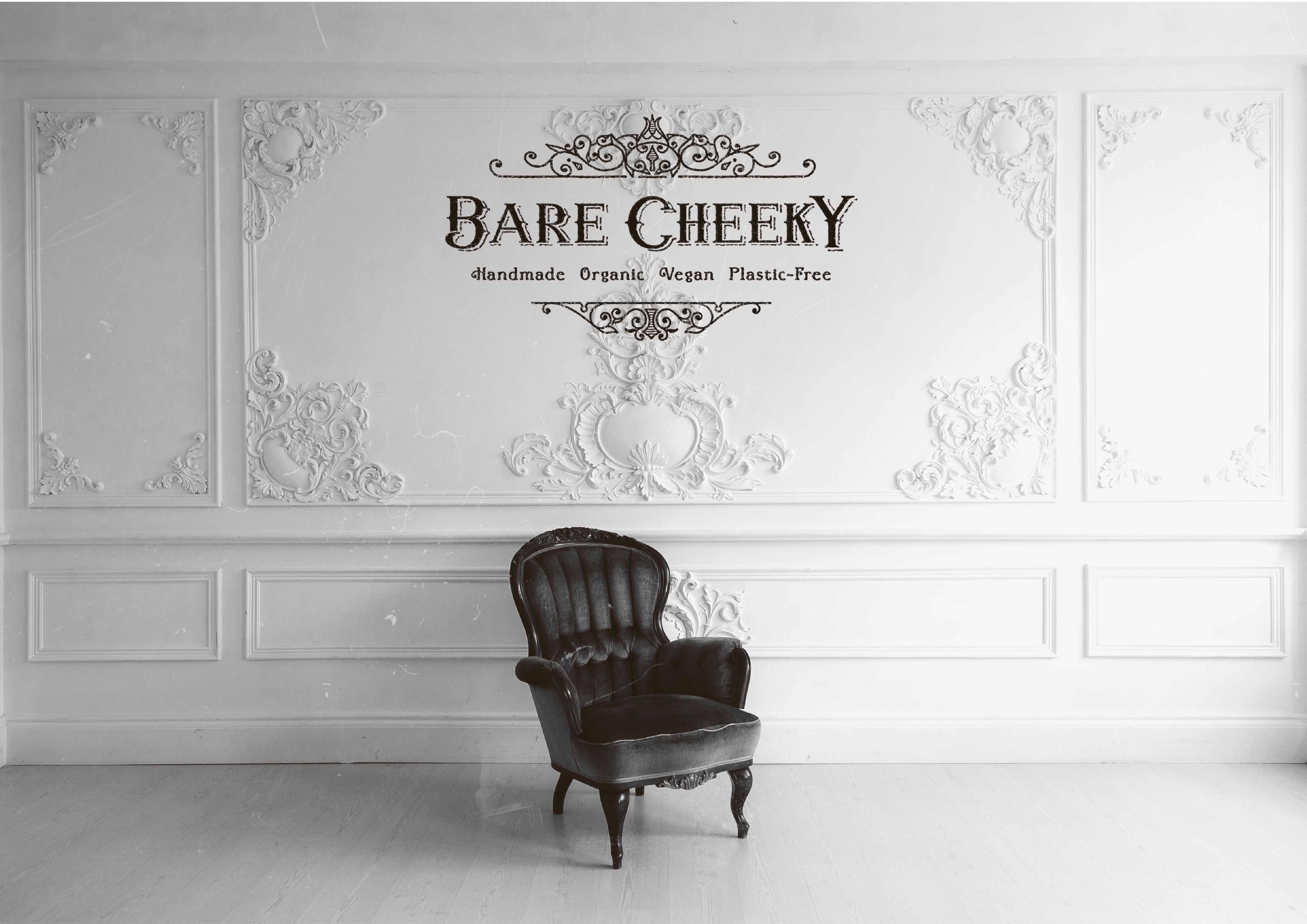
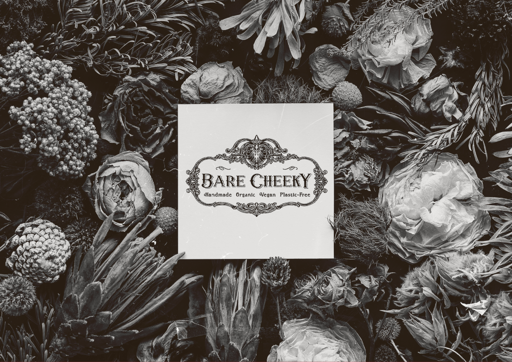
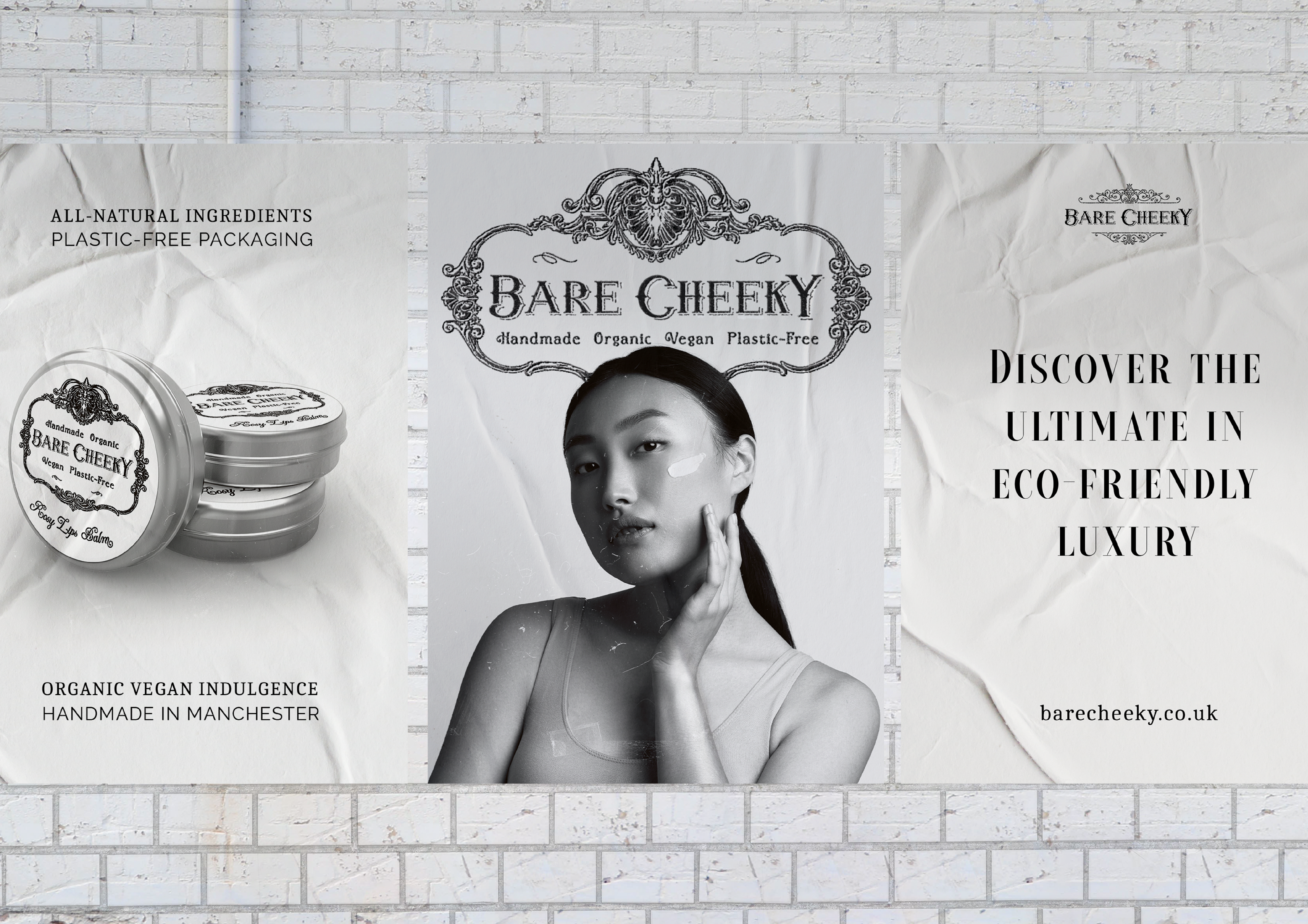
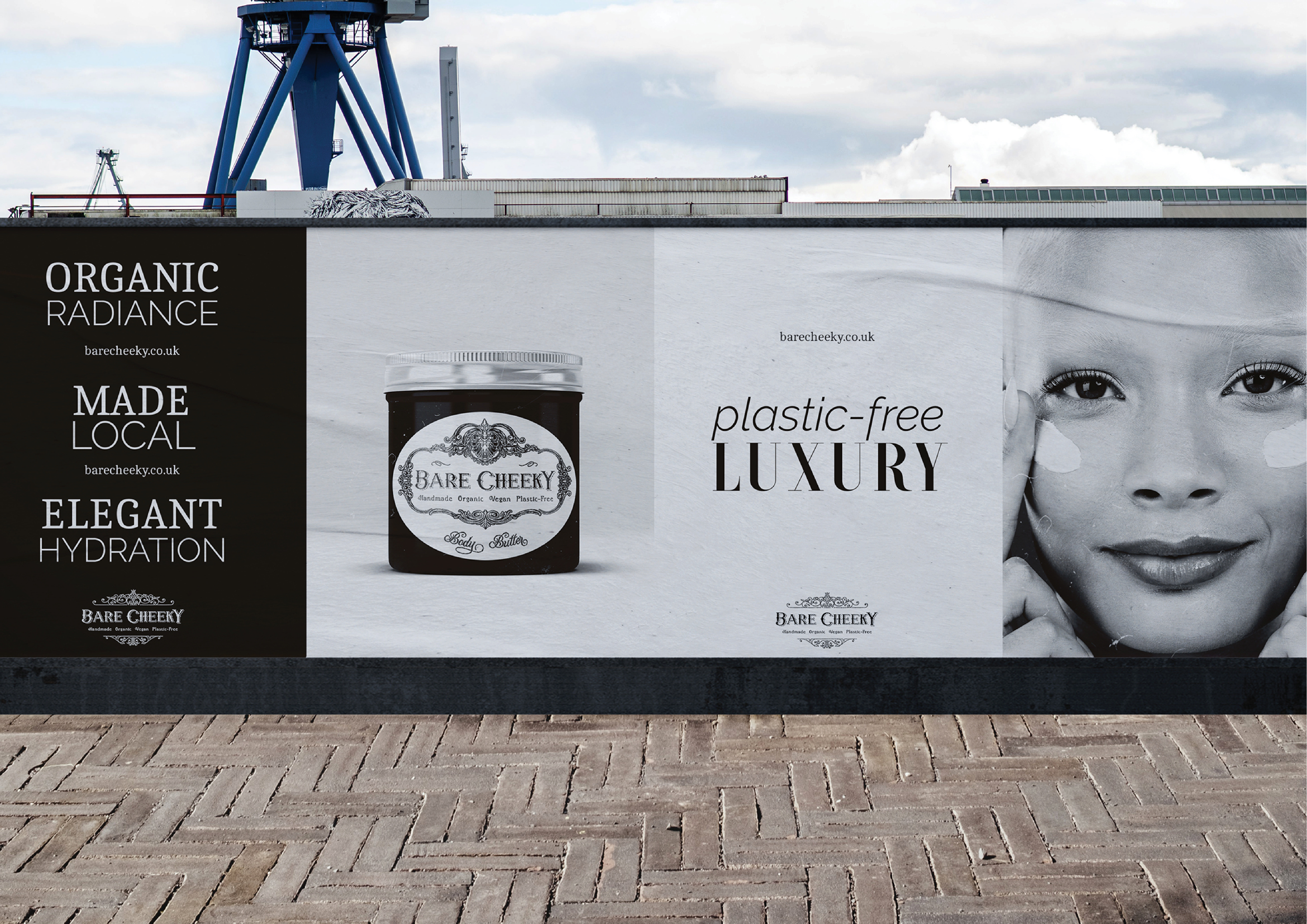
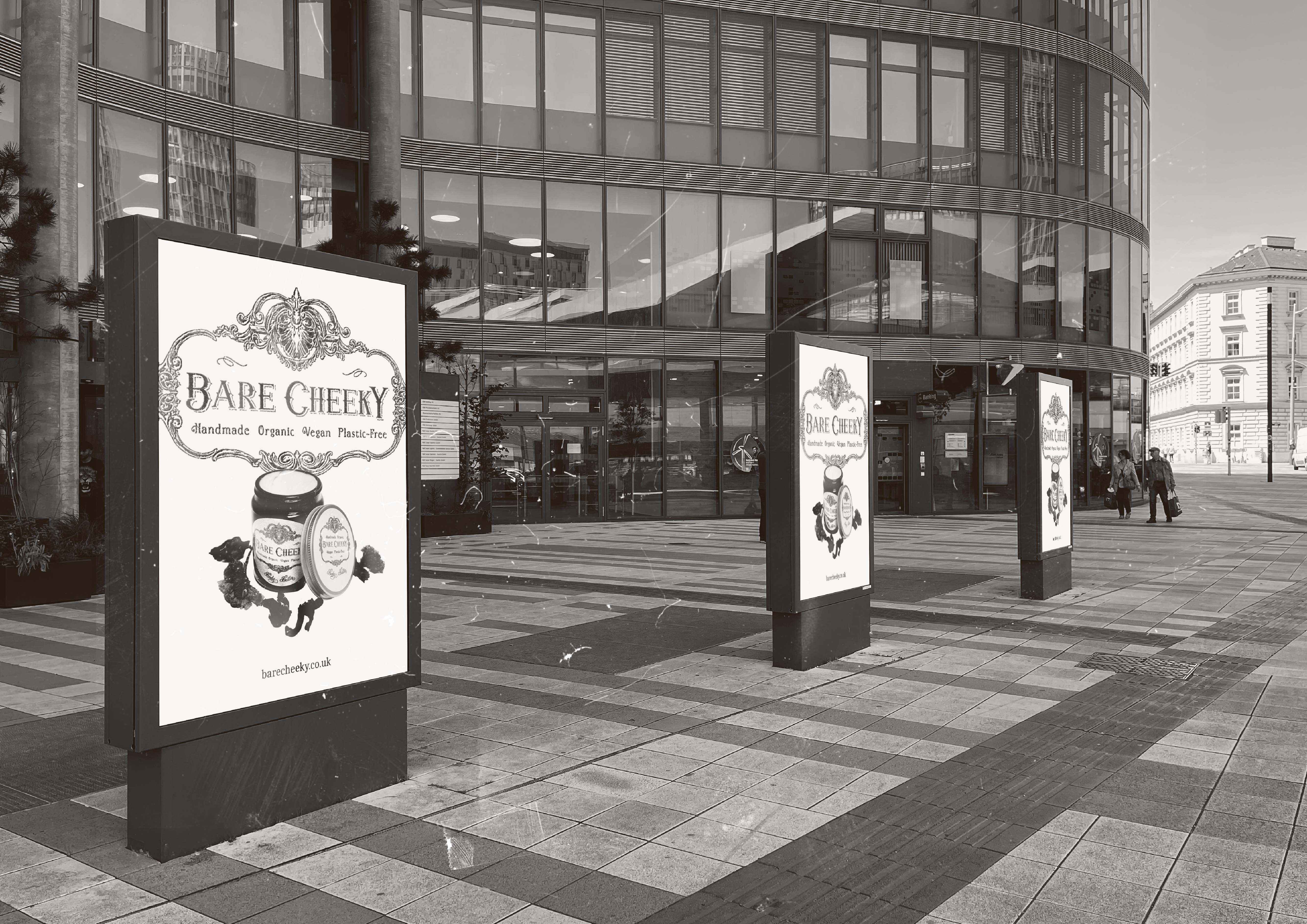
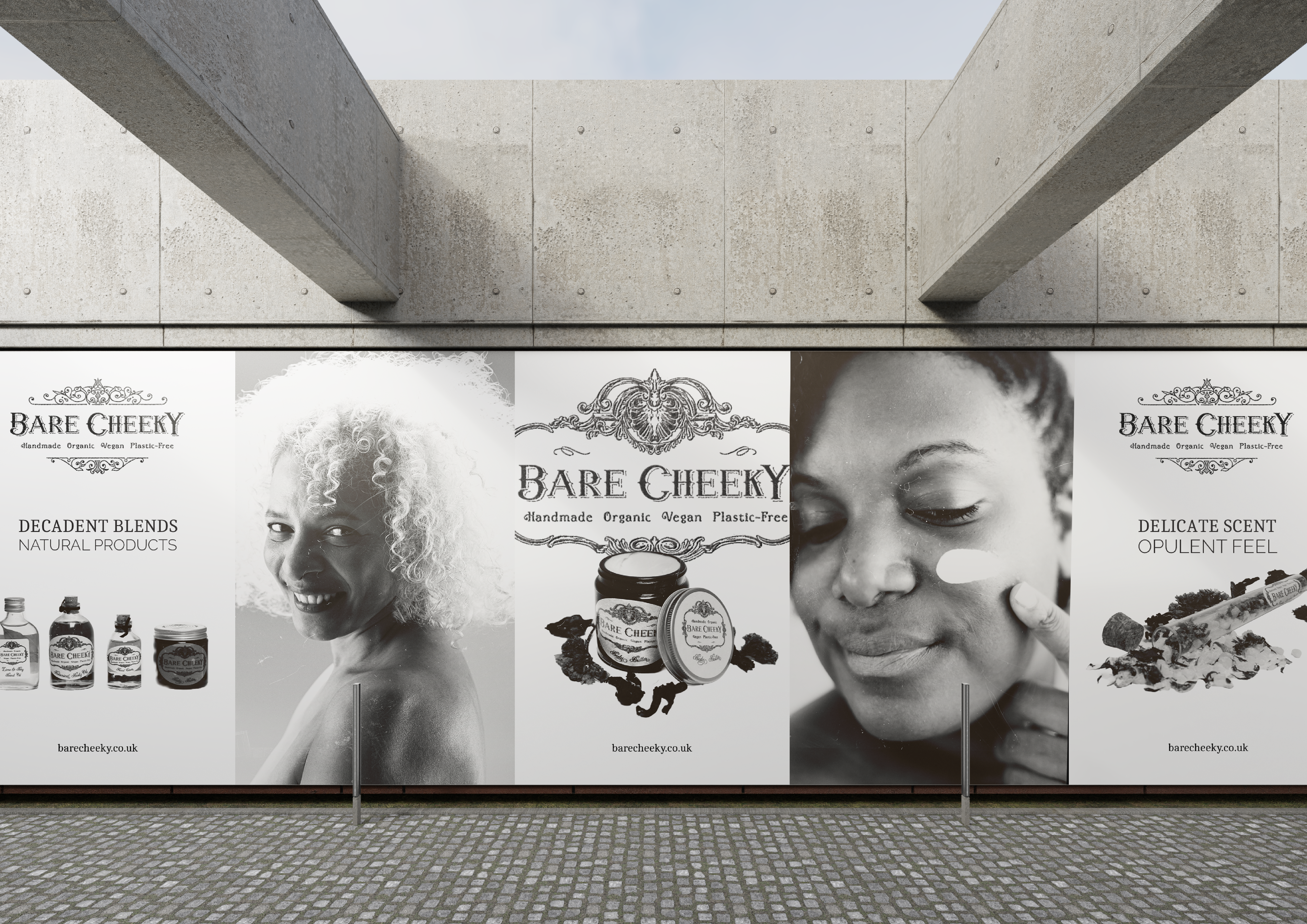
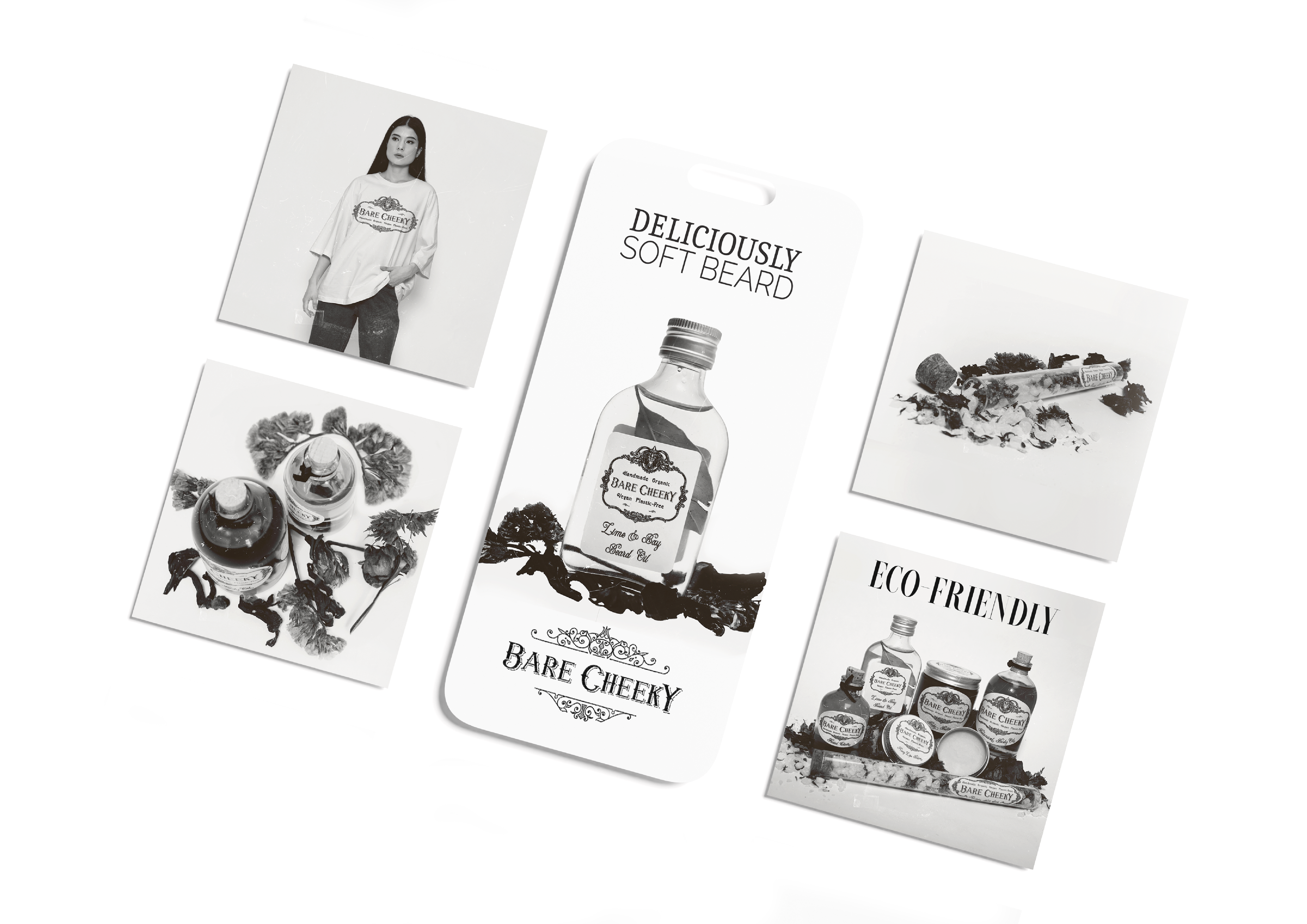
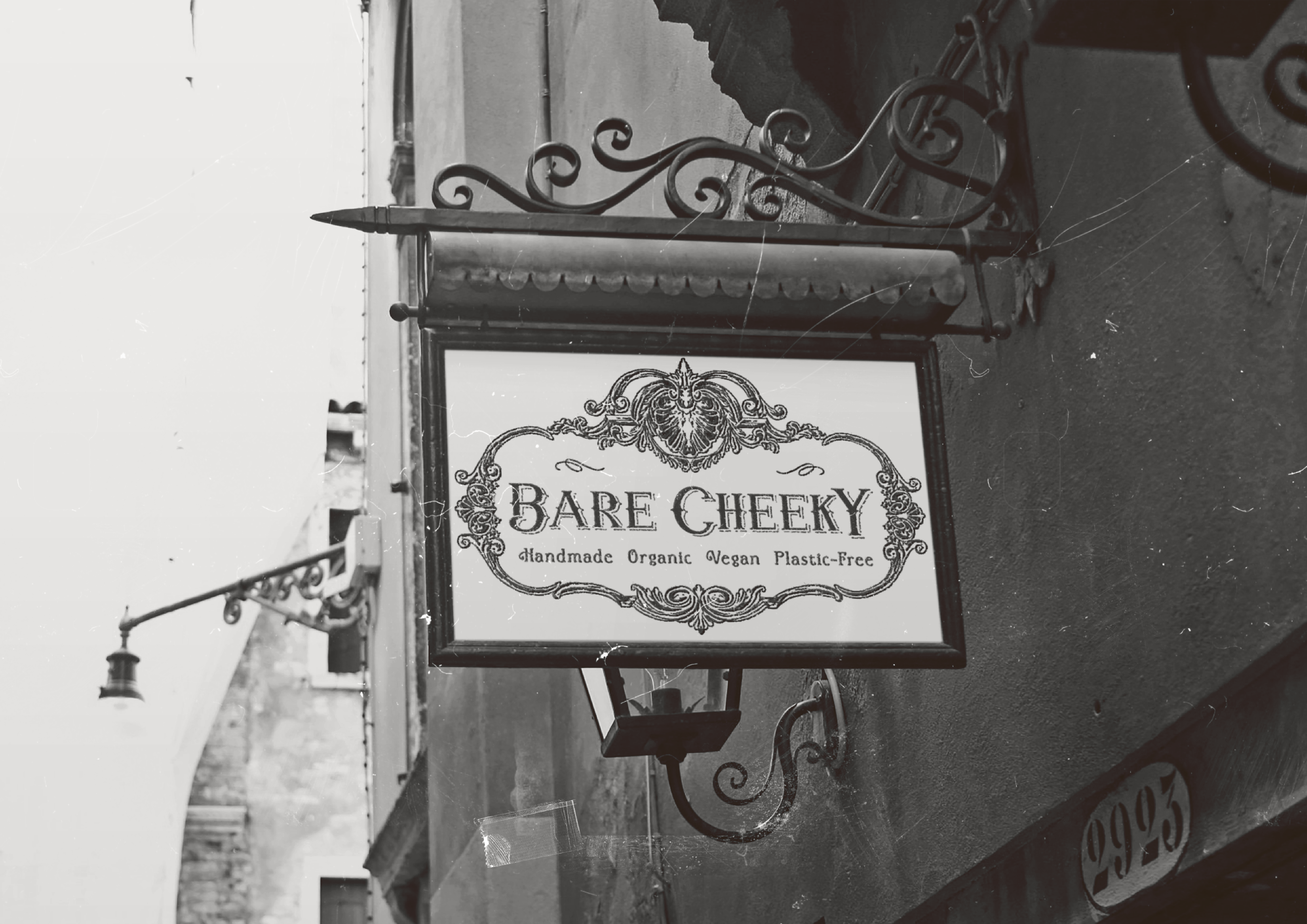
My goal was to create a brand identity that balanced eco-conscious integrity with refined femininity. The challenge lay in ensuring Bare Cheeky felt luxurious and glamorous without losing its organic, handmade roots. Drawing inspiration from vintage European apothecary labels and French patisserie aesthetics, I developed a visual system built around ornate circular frames, delicate detailing, and elegant serif typography.
Packaging labels were carefully composed to evoke heritage and craftsmanship, while maintaining clarity and practicality for modern retail environments. The monochrome palette reinforces sophistication and timelessness, allowing texture and illustration to take centre stage. Across the price list and supporting collateral, consistency was key; ensuring every touchpoint echoed the brand’s ethos of self-care, indulgence, and sustainability.
Brand Voice
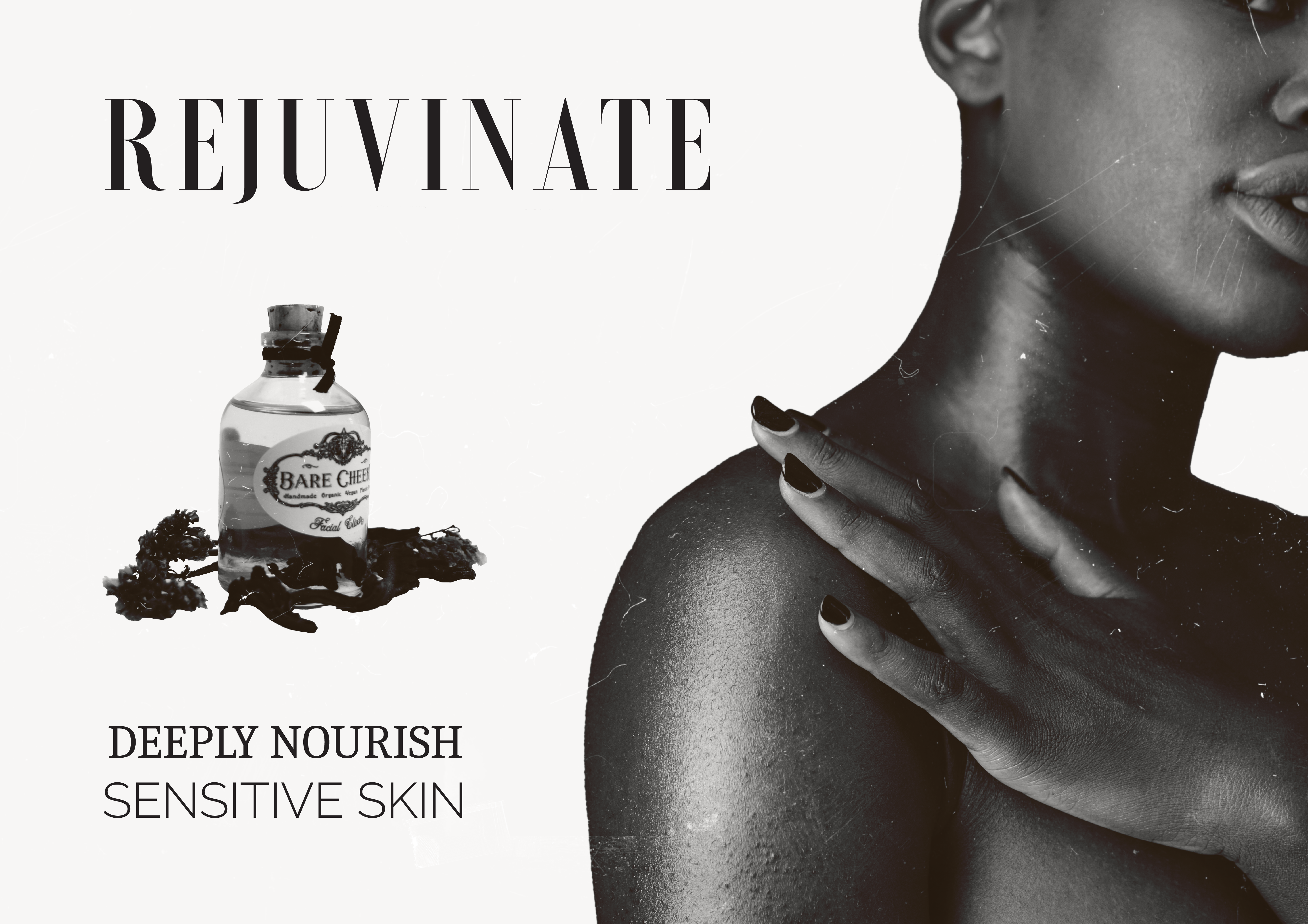
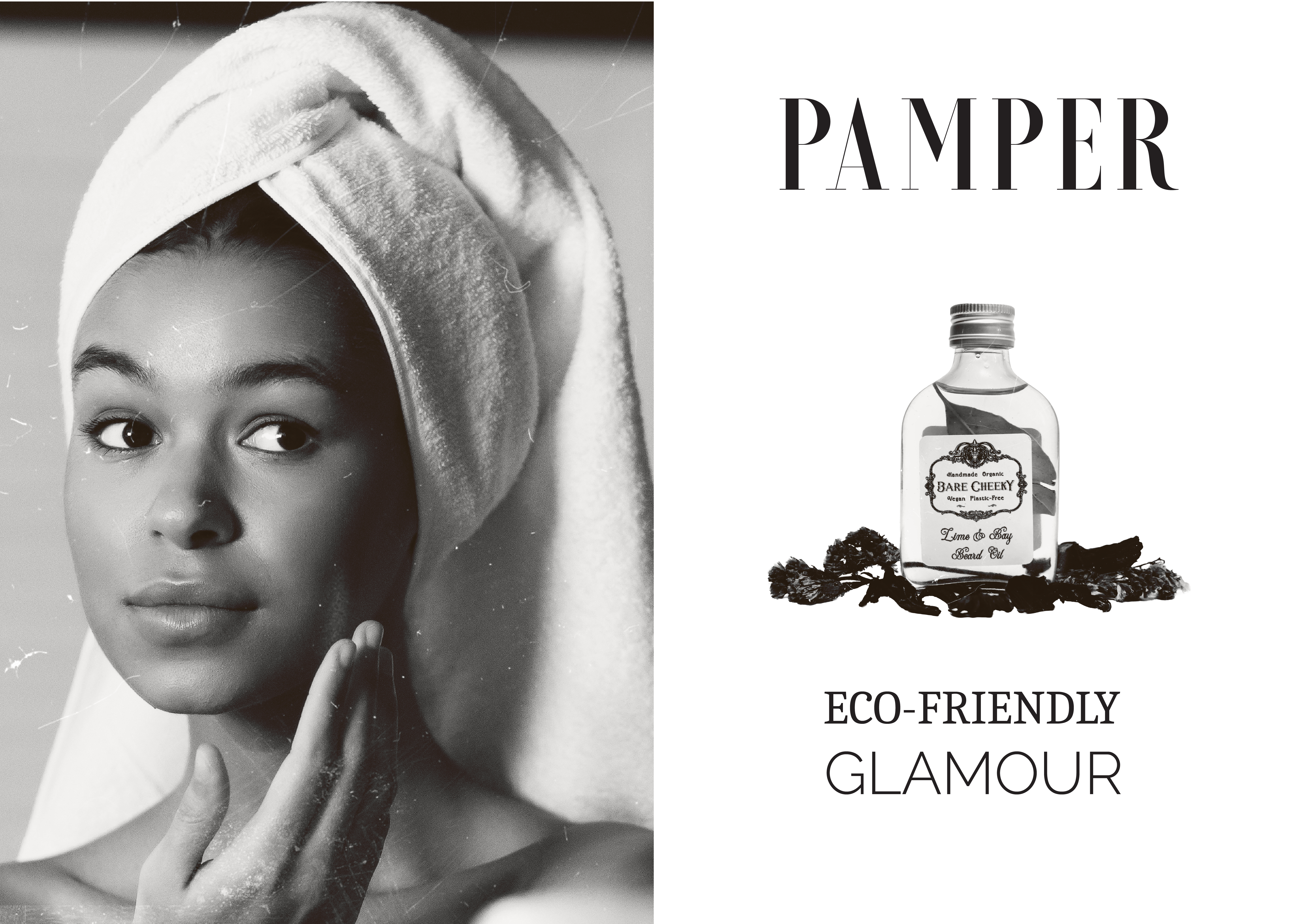
Bare Cheeky’s voice is romantic yet assured; indulgent without being excessive. It speaks in a tone that feels intimate and feminine, celebrating ritual, scent, and sensation while remaining grounded in holistic wellbeing. Language leans into elegance and sensory experience, using phrases such as healing, rejuvenating, indulgent, and harmonious to reinforce the emotional connection to self-care.
Across packaging, price lists, and storytelling, copy balances luxury with conscience. References to organic ingredients, small-batch production, and plastic-free packaging are woven seamlessly into a narrative of sophistication and self-worth. The result is a brand language that feels nostalgic yet contemporary; inviting customers not simply to purchase skincare, but to embrace a ritual of conscious elegance.